
I’m posting about the artwork again to follow-up on the contest and the desktop backgrounds for Linux Mint 9.
Wallpapers included by default:
The following wallpapers will be included by default in Linux Mint 9 (click on the pictures to see them in full size).
From “29A”:
From “Talento Design”:
From “At your service”:
From “96works”:
From the Linux Mint community, (from left to right: “Emotion” from distro hopper, “AirMint” from dkreations and “LM9” from Zwopper):

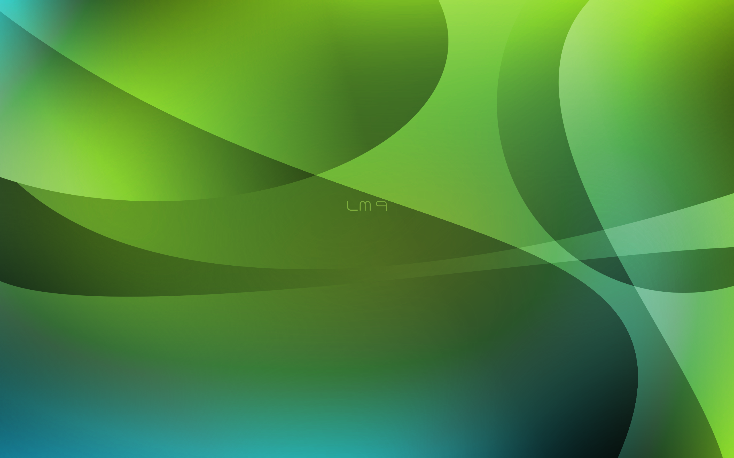
Note: “LM9” from Zwopper will come without the label shown on the above picture.
Note: If space doesn’t allow it, some backgrounds could be removed. The pictures which are sure to be included by default are marked with a thick border.
The default background:
At the moment, the default background is the one from “Talento Design” (first one below). Alternative choices include a design from “96works” and “AirMint” from dlkreations. See below:

Poll: I can’t promise I’ll follow the majority vote, as always I’ll do what I think is best but I’m interested to know your thoughts on this.
[poll:12]
Other backgrounds:
A number of packages will appear in Linux Mint 9:
- “mint-wallpapers-extra” will contain many wallpapers made for Linux Mint 9 which weren’t installed by default, unbranded versions of 96works’ artwork, variations from Talento Design and At your service, and a few others.
- “mint-wallpapers-previous-releases” will contain the wallpapers used by past releases, such as the very popular “Dew” used in Linux Mint 7 Gloria, and the black wallpapers used in Linux Mint 3, 4, 5, 6..
- “mint-wallpapers-source” will contain the .PSD, .XCF, .SVG sources of the wallpapers and also the Linux Mint logos. We bought the copyrights on the artwork from 29A, At your service, Talento Design and 96works and we’re freeing it all for everyone to use. This package will give artists in our community great resources to start from, to modify and to reuse for their own creations.
- We’ll also probably include a community package which will grow bigger as the community adds to it, but this is likely to happen after the release of Linux Mint 9.
Blue, green, black:
Many of the backgrounds shown above are also available in blue and will be featured in the KDE edition of Linux Mint 9.
The plan to design a metal-looking theme was postponed to Linux Mint 10. Black backgrounds are likely to come back into fashion at that stage. At the moment, we’re using a black panel and so we’re happy to stick to green for the background (as you can see there’s a lot of green in the pictures shown above).
Focus and efforts:
We’re working really hard on the upcoming release. We’ve looked at a lot of things, we’ve made many improvements and there’s been a huge amount of coding done for Linux Mint 9. I’ve no doubt people will be pleased with the release as we’ve significantly made things better. I know some people are upset when we talk about artwork, either they don’t see the importance of it when it comes to users’ first impression, or they think that the time we put into this is time taken away from more important things. This is the icing on the cake, something that comes very late in the release cycle… something which priority was low but which is extremely important to us as we’re getting ready to release. Attention to details is something we can’t oversee. When it comes to look & feel, things are so subjective and trends change so fast that it’s easy for us to make a mistake, but we’ll spend a few days at the end of each release cycle, like we’re doing right now, and whether we get it right or not, we’ll try our best to relax and to put efforts in making Linux Mint look the best we can.
It doesn’t matter to me as I will be using my own favorite background anyway. Currently, I prefer one of the new ones from Ubuntu 10.4 called Maraetaibeforesunrise.jpg I also have two others I like, one called Bushido I found on the net and another one called silence that I got from an older version of OpenSuse. The thing about backgrounds is that they have to be easy on the eyes for working all day at the computer, and the icons have to be clearly visible against the background. Then there are the psychological effects as the brain perceives everything it sees as reality. That makes a good case for pleasant nature scenes.
LOVE the Talento design one. Excellent choice in my opinion, Clem.
Its a tough call between Talento Design and 96Works. I like 96Works, but it is a bit too bright. If the Contrast was adjusted to make it a little darker it would be perfect.
I love the mosh green in first wallpaper from “at your service”. And the leaves touch bring another natural thingy.
“Emotion” is the one for me.
I think the Talento Design is too light in the lower left corner to allow any icons to be placed there.
I like the “Emotion” background much more – it’s more mysterious and complicated.
But – great work Clem and the rest of the gang – I’m looking very forward to working in Isadora, soon.
Uh… I hate to be a stick in the mud, but… I really don’t like the 29A-wallpapers. I’m sure they spent a lot of good effort on it, but… sorry. I don’t think pictures with that much action in them make good wallpapers…
Had a bugger of a choice between 96Works and AirMint, but I went with 96Works.
(I notice a slight difference in artistic preference between myself and the Mint Crew. 🙂 )
Yay Talento design is awesome.
But aren’t you going to use the one with the logo?
Got a reputation to keep up.
Emotion
The right one is not so bright, quiet and looks beautiful mint.
like the airmint but prefer this http://99designs.com/designs/4310463-original
I would love to get the “At your service” wallpaper in widescreen. Do you know if these will be offered in both full and widescreen resolutions?
I prefer the Talento design with the logo (rightmost).
I prefer one with a logo and/or name.
I like one that has the phrase “from freedom came elegance”.
Marvelous however please include the default Felecia wallpaper. I have been running off the Isadora repositories whilst maintaining the Karmic repositories for around 10 days now and things are taking shape nicely.
Honestly, I believe a wallpaper should not be overly busy, and much more simplistic. That is why I vote for the first one made by “At Your Service”. It would give a warmer feeling to the user using Mint 9, and would therefore be an ideal choice.
I like “At your service” N°2 Desktop Backgroud.
http://99designs.com/designs/4292706-original
But i think the best desktop is definitively for me Black leather: http://forums.linuxmint.com/viewtopic.php?f=20&t=36185
PS: I dream for a Linux Mint 9 DVD not limited by 700Mo with full Power of LinuxMint by “Clem”.
X64 version only for me… I’m waiting
Thanks
I think the sharp vertical line in the lower part of the Talento Design Wallpaper is standing out too much, otherwise pretty OK.
Personally i’d prefer the AirMint Wallpaper.
Sorry about the double post. Although I believe Talento Design is a great wallpaper, I just see too many wallpapers nowadays with a bunch of streaky lines. Which is why, I once again, propose the “At Your Service” wallpaper.
As for the backgrounds, they all are excellent, and I’m envious of the talent we have in our community. I’d be happy with any of them, but if forced to vote for a favorite, I’d say it would be “Emotion” from distro hopper. But several others are a very close second.
I vote for *not* a 96works wallpaper due to the small size. As a result they are only really suitable for a netbook.
Also it might be an idea to get away from the Gnome=green KDE=blue thing that’s going on. Let’s just have a selection of colours either unbranded or with the default Mint logo to choose from.
The ones I prefer are “Emotion” from distro hopper, and the first one on the left from “At your service”, with the leaf. They are more “human”, if I can say.
I would not consider none of the three default background at the moment.
But, he, you know, it’s all very subjective and people will choose or switch to the one they like.
1st of “At your service” (but in larger resolution to have the logo and leaves smaller)
My vote goes to “Emotion” from distro hopper!
Please provide blue variations of these wallpapers in Gnome version of Mint, too! It doesn’t have to be all just in green…
All the wallpapers are nice, but I do think there should be at least some natural wallpapers. In other words, pictures that were taken from a camera of scenery and views that are beautiful, instead all of the pictures being made on a computer in some graphics editing program.
The more, the merrier! I think many beautiful designs should be encouraged. I personally use Wallpaper Manager to change my desktop background, and new additions only make it more interesting. Linux should be beautiful! Kudos to all the designers on their work.
I like “At Your Service” wallpapers…
I liked (very much) the black leather background with the mint logo and will be using that one. All my PC hardware is black and this looks cool.
http://imgur.com/x61ay.jpg
Tom
I prefer “Emotion” but in blue (for Gnome though) and no labels.
What do I know, but I’m really not a fan of the Talento design – it looks like the sort of style used by certain other OS’s! sorry to say it.
However, Emotion is fantastic, well done to distro hopper!
lm 9 zwopper
lm 9 is the best hopper
I like the first At Your Service one with the leaves.
At your service, of the left is the best
I honestly don’t like any of them. I hate to be a hater, but they’re all garish and bright green!
Let’s think back to (around about) Linux Mint 5 era. The desktop then was black, with the Linux Mint logo in the centre providing a tasteful green highlight. That was fine. I like that style. It was slick and professional, but subdued enough to not be an eyesore.
tl;dr How about a wallpaper where lime green isn’t the primary colour, but is instead used as a tasteful highlight colour.
LM9 Zwopper
I like the left wallpaper “At your service” did, it seems to really stick out to me. I think it’s awesome we will be able to get a bunch of new wallpapers and have the opportunity to change and be creative with them to make them feel new and fresh and unique for a long time. I am really looking forward to Mint 9, congrats to the artists and LM crew! everyone is doing an amazing job as always
“Emotion” is the nicest for me – looks so alive, fresh, a bit dark and misty, yest still cosy-looking. I just love it.
Anyway, I’m very happy that there will be more wallpapers included. More choice with little effort. Sad that the metal theme was dropped. Or perhaps I shouldn’t expect to get everything at once 🙂
Definitly the moss one from at your service closely followed by airmint
Emotion conveys the very essence of mint: freshness, elegance, brilliance. I personally think that a wallpaper should accomplish a BACKGROUND function, it shouldn’t shine more or appear more that the front-ground, that is, the icons. Also, wallpapers that are too bright or too saturated tend to wear the eyes too much. As such, a good wallpaper should have a calming effect, something “dew” achieves a lot (eyecandy in a mint-style).
At your service (left one), Emotion comes second – please forget about the high-tech feeling and go natural !
i like at your service, the left one. it’s convenient for background, since it differs from the way windows themselve are designed and presented.
the 2nd from “At your service”
I just skimmed through the replies and it seems to me that I am the only one who really likes the first Wallpaper from “At your Service”. The others are really nice, too, but look kind of uniform in their style. I like the warmth that it gives to my desktop. If the leaf was a bit mintier, it would be perfect. Nice work everyone, this truly is an amazing icing! Can’t wait to have it on my desktop!
These designs are nice. The only problem (that I have) is they are too busy. A background should be just that and not overpower the user when s/he is looking at the desktop.
Can we tone it (them) down somehow?
I prefer “LM9″ by Zwopper.
My second choice would be the first one by 96works.
Thanks,
Tim
OK, my 2 cents. The art work are very nice, I voted the one of my choice. In my opinion, Mint should offer a background for the splash screen and another one for the desktop. Any one agrees on that?
wow!!!
Prefer the ‘At Your Service’ left side. Keep the version number out.
I like “emotion”, it just looks good.
LM9
I like:
“Emotion” from distro hopper.
http://img94.imageshack.us/img94/5548/1920x1200u.jpg
They are all very nice but u got my attention more than the fpi “at your service” he is wonderful! the face of Linux Mint.
All are very beautiful. But what most caught my attention was the “At Your Service” that is spectacular! is the face of Linux Mint.
I voted for Airmint as I don’t care for ones that one area brighter than the other as some of them do. It matters little anyway as I change my wallpaper infrequently as it isn’t seen often, and I change from the default.
I do wish there were darker choices, too much bright green, though true most distros don’t use green. Still excellent work, looking forward to LM9
Je continue à choisir “LM9″ de Zwopper.
I voted for Talento, but I really like the 96works entry as well. However, with it being so white in the corners I wonder how much detail you would lose if you had icons there.
All of that being said, I’m not one for change much. I’ll probably just go back to “Dew” because I love it so much!
Specify : I like very much “Emotion” from distro hopper.
Also, if Zwopper’s LM9 had the traditional LM logo in the middle, that would be awesome!
The #1 thing I miss from Linux 7 is the wubi install. Is this fixed in 9?
first(left) picture of ‘At your service’ is very charm
@rhY: I second that. Background schmackground – but will wubi be fixed?
“Poll: I can’t promise I’ll follow the majority vote, as always I’ll do what I think is best but I’m interested to know your thoughts on this.”
Stupidest thing I have ever read.
And please change the boot screen for v9.
as if a subjective choice like an image could be thrown out into “what I think is best”, meaning: the one u like the most.
I like the 96works, just get rid of the number 9. Keep the logo.
I use MS-Windows colours in order to confuse windows users – it’s fun and works
Guys, look this. It is very cool. Here is the link: http://leonardomdq.deviantart.com/art/Dreams-162027268
How about use this themes on Linux Mint?
Talento Design (Right)
I do not mind, they all look great. As long as there is options to choose these in Linux Mint 9 that will be brilliant.
I would choose Emotion from distrohopper.
Tough I can see why you wouldn’t want that as a default, it may be a bit over the top in complexety.
I really don’t care what the background is. However, it should have the Mint logo. I burn CD’s, distribute, and often install Mint for others. All of these installations either replace or dual boot with Windows. Some of the people I install for are; to say the very least, computer knowledge challenged. The appearance of the desktop background gives the first impression of Mint. One that is appealing goes a long way in converting them to Linux. Kudos to Clem and all the contributors. Thank You for all your efforts.
This one is the best:http://99designs.com/designs/4309745-original
defaultwallpare 96Works (center) should have sharper text and mint logo.
what do you think about it?
I have been using the revolving Astronomical Pictures which shows pictures of the Earth (from near space orbit), planets and Deep Field Space shots. I hope they will remain easily available.
Perhaps this rotating presentation method could be employed to show a number of the fine examples of the Desktop art, above?
I’d choose “Emotion” from distro hopper as the default background (especially if it included the distro logo).
I prefer the rightmost one from Talento Design w/the logo.
Emotion. This particular wallpaper looks extremely sophisticated. Love it.
this was my embarrassing attempt. I’m not sure if it’s appropriate to link to it here, but what the hey…
http://img85.imageshack.us/img85/6894/45568657.png
I did this with Paint.net in under 3 minutes. I’m that good ¦]
LM9- i like that
“Emotion” from distro hopper.
Most of them look really nice. Just the 29A designs and the LM9 design from Wopper do not fit in the Mint Professional style.
Not bad, include all and we can choose later after install. However, I have already said, I will use my background it doesn’t matter which one you will include.
Cheers,
The first one of: At your service :).
is there any way we can have the nice background back that was in Felicia?
Emotions for me….
I’d prefer the 96Works, but the left one !
#75: yes, i am thinking the same. the new backgrounds are nice, but the one in mint 8 is really great and i will use it in mint 9 as my deafult background.
emotion 🙂
I clicked originally other, but changed mine to Talento Design, I tried it out on my backround and I like it a lot. Even though I am a KDE user, I HATE the air backround…so please don’t pick that…Its always the first thing I change.
I do hope all the wallpapers come packaged as they are very well done.
AIRMINT has my vote for default,
its classy and elegant….like mint. 96Works even though popular I dont think fits, as default at least, it just doesnt look right, and all the wallpapers with a big 9 on them just seem out of place and a bit *young* if you know what I mean. ( no offence to the creators and their hard work)
but why stop at the wallpaper? the grub menu could do with a change, as could the log in. green, for the desktop needs to stay, but please not bright green for the grub and log in.
something like…..
http://jernau.deviantart.com/art/Linux-Mint-Glass-104288359
http://jernau.deviantart.com/art/Linux-Mint-Balls-103957287
http://jernau.deviantart.com/art/Linux-Mint-Graphite-103416780
would be excellent in their place for mint 9, everything even down to the font absolutely embodies the elegance of mint I think, seriously class. even as bundled wallpapers would be cool
*keep mint elegant guys!*
also, how about some changes to default apps? banshee 1.6 for example? its way ahead of Rhythmbox, and Docky??
I really like the first from “At your service” Clean simple and elegant.
At your service, second one.
Hi,
I looked at some of the other desktops a week or so back and I must admit I’m hooked on the following:
http://forums.linuxmint.com/viewtopic.php?f=20&t=36185
All the best.
Carl
I like the one from community called Emotion…
…but it doesn’t really matter, as they all look awesome!
Some of the best mint wallpapers, EVER…
Sorry for double posting.
Actually, I can’t wait until Mint 10 gets out now that a metallic theme is mentioned and darker backgrounds. All this green can get old. I also agree with Clem about paying attention to detail and first impressions. Keep it going.
Mint never had any decent wallpapers! Those above are no exception, that is how i feel anyway.
However mint is the best linux distro out there not because of a wallpaper (that most people change anyway) but because of the huge effort the team puts into it to create something unique that works flawlessly…well almost 🙂
The Talento design is really good for its purpose. It is wallpaper, after all, not art museum works meant to arouse, anger, or inspire.
I agree with some of the criticism about the bright, garish green, however. A quick trip through GIMP could fix that. Just a tinge to the blue-green side of the spectrum (and away from chartreuse) would make it less jarring.
My vote went for LM9 by Zwopper. Perhaps it could have the traditional Mint label?
I prefer the 96works left, and would agree with some of the others that a good background shouldn’t be too busy, and I feel like quite a few of these were too busy. Oh well, can’t wait for the LTS 9 to come out!! I personally loved Mint 7, Mint 8 just felt a little bit off to me, though it had many improvements I just didn’t connect with it quite like I did with 7, I’m hoping 9 is my new 7!!
I love Zwopper’s but 96work’s first wallpaper (the one not boxed) is really really really really good!
Definitely my favorite of the bunch.
i like the freshness of emotion! mint rocks!
my faveourite is definitely the first one on the left from 96 works, i’d love to see that one as the default for the KDE CE! “emotion” by distrohopper is a VERY close second, and i think the blue KDE version of it looks a little better than the green… eh boo? out of the three you are considering, i’d say the center or right ones… its a tie.
Emotion is the best
Emotion and AirMint look better than the others.
Talento Design’s work is great, but I do like the crazy ‘Emotion’, & ‘LM9’ is aesthetically very pleasing.
I just converted my machine to ‘Helena’ yesterday, from Xubuntu 9.10, which was far too limited & untidy for my requirements & liking, & I’m pleased to report that everything works even better & faster, maybe something to do with all the really useful stuff being included as standard. Now, I WOULD recommend it to anyone interested in ‘converting’.
Great work by Clem & The Team for taking a great idea & making it even greater.
I like the Emotion wp… I’m using it at my work’s pc.
I love the 96Works wallpaper. It is the only one that fits elegance and superbness of Linux Mint best 🙂
My preferred wallpaper is the 3rd one from Talento (4310463) as it is abstract but features the Linux Mint icon and as such strongly conveys the identity of the distro.
If you use white text below desktop icons, the background image needs to be dark(er). I selected the darkest of the three you favoured. The favoured one on the left is too light.
No strong preference, but I voted for a change that will still allow added personal favourite desktop icons to show up well.
From several decades of discussing Man-Machine-Interfaces, I know that soft green is the best colour for clarity without headaches, closely followed by amber, so the general Mint approach is fine with me. However, individual colour vision varies more widely than is generally appreciated, which is why some folk are so vehement about their choice of colour. An installation process that offers a choice of initial defaults, whilst then allowing session change when a different user logs in has always worked best. Me, with Win311 and then NTFS351, I used to get a headache from the default intense dark blue title bars, but getting ‘almighty SysAdmins’ to change that could be an even bigger pain !
I like Emotion. It’s a lil darker, (many of the the others seem too bright) looks a little more organic, and I like and Airmint as well.
I’m not a fan of all the big number 9s that are being implemented, and the talentos ones look a bit dull, a bit too Vista-ish.
My favorite is still the default that’s included with Helena.
“At your service” the best!!!
I like the second one from ‘at your service’ and voted for ‘others’
I think this one: http://99designs.com/designs/4310463-original will look really good as the background, and it gives the impression that LM is the center and everything goes around it, like a new born star…
the ‘At your Service’ are refreshingly different – they get my vote!
I use Mint as it is the best OS. Since Mint 7 I have used my own desktop system as I dislike the current green and black. To me it looks so morbid, dark and depressing for everyday. I use a colourful and positve desktop to keep me in a good and cheerful mood.
http://picasaweb.google.com/dark.beige/MiscPrettyPix#5389318221932270882
I liked 96works but the left side design. I would prefer if the Linux Mint name and logo are centered on that one, but other than that, it looks quite clean.
But you know? all of them look awesome.
Include past versions’ backgrounds as well, in the selection – at least the top ones. Many of us have become attached to the ones we love, and may not feel excited about any of the new ones proposed here.
This having been said…
Stop procrastinating and release it already! ;-p
why don’t we have some dark themes instead of all greens?
I feel very strongly that we must use the “Emotion” work as the default background, or a similar piece: In both widescreen and fullscreen of course, which could be automatically detected w/ a simple script. Even though I think a lot of these works are awesome, and I’d probably use most of them at some point on my own machines; the look and feel of the darker and plain works are more professional and attractive, especially without the flashy logo and bright colors.
Clem: Leave out the logo and text and maybe you’ll attract a wider user base. Maybe you should take a poll on age, ’cause if the IRC channels are any accurate indication of overall users; I’d say most are teenagers and young adults (who would typically choose the flashy, exhibiting backgrounds).
Even though we all love this distro and want to show it off, braggy backgrounds might be more offputting to new converters who haven’t experienced enough of the awesomeness of mint yet.
i feel like to use 96works (center choice)…simple clear and good recognized…thanks for the job
96Works is okay but a little hokey. Talento Design is much better but to me it says “I’m a Mac.” I like AirMint best; it’s crisp and screams “Linux.” Penguins would like it.
Also, you should make space in the distro for all the backgrounds by Talento Design, they are quite excellent.
The talento bckground does for me, except for one little detail: it doesn’t has the Mint Logo on it. Add it and will look perfect.
Really like the LM9 one by zwopper.
<3 Airmint <3
left one of 96works looks the best out of all the wallpapers!
nice I love Linux Mint
i say, emotion~
I like the 4309745-original from 96works more → 2. is AirMint. This Green is looking very well together with my Midori and Agave icon 😀
Thank you Clem for taking care of the artwork, every Mint is looking nicer!
The 96works one is bright and a little pale to me.
The talento has a nice dynamic to it, which is nice to look at over time.
This has always been my fave…
http://beautifullinux.com/web/wallpaper/LinuxMint7/images/Wide_Swoosh.jpg
/twocents
😉
I voted for other because “Emotion” is definitely my favorite. Looking forward to the next release!
Personally, I really like the 3rd of Talento design, the water effect or whatever it is looks great, and it is very dynamic. I am always glad to see the logo there, too. But the first one is nice too =)
I personally like the leaf one from at your service. It’s different, and it doesn’t have the feel of Vista like Talento Design and 96works do.
They are awesome!!
I like Talento very much, but the others are very nice too.
At this moment, I’m using Buttlefly (an old Mint desktop background).
Fortunately, we can get all of them!!!
Thanks to the Mint artists.
mint is the best amd the finest of linux and open source OS’s. thanks guys you are doing a great jod
96 works(center) is the best,just it means mint…
Talento (right)
downward in orientation, it will lead the new user’s eye to the Mint menu . . .
Both Talentos are really beautiful!
In my opinion, these are all terrible, except maybe Airmint. I loved the simplicity of the wallpapers in Linux Mint 8. These are wallpapers that would be very distracting in every day use. No offense to the makers, but the ones from 29A are the worst.
Take note of the simplicity of the Linux Mint 8 wallpapers, they’re simple, yet beautiful. Hasn’t your slogan always been From Simplicity comes Elegance? I don’t see simplicity or elegance in any of those wallpapers.
About my above post, I just remembered the slogan was “From Freedom came Elegance”. Although I was wrong about the slogan, my point still stands, none of those wallpapers are simple or elegant.
AirMint is the nicest one. Although if I had to choose another one, I’d choose Talento 🙂
P.S. YOUR BACKGROUNDS ARE AWESOME 😀
LM9 by Zwooper is so good that I’m using it onto Windows 7 (while I wait ’til Mint 9) and seems beautiful.
http://i43.tinypic.com/35mjh3b.png
If “From Freedom came Elegance” the Linux Mint community is far from Elegant. Freedom of speech is one of the most important freedoms, yet it’s not given in a community based around freedom.
In my previous comment, I stated that I disliked all of those wallpapers, “Especially the ones by 29A”, and that we needed to look for a more simplistic design. All of those wallpapers are flashy, and look nice at first, but would be distracting and ugly in normal use. Why can’t we look back at Linux Mint 8, in which every single wallpaper is simple, yet beautiful and elegant. I usually change my background in any OS, but in Linux Mint 8, I left it as the default, because it’s simple, subtle, yet beautiful. These are bright, ugly, and distracting. I know most people will just change their wallpaper, but think of the new users, the people who will install Linux Mint, and get a bad first glance. We all know the first glance is the most important, if they run the LiveCD, and it’s ugly, they’re not going to install it. The wallpapers in Linux Mint 8 were subtle, yet beautiful, and drew the user in. I loved it. The only wallpaper there I like at all, (And it’s a stretch) is Airmint.
Please think about it. As the Linux Mint Team, it’s your distrobution, and your choice, but it’s my honest opinion that those wallpapers are bad decisions.
Oh wow, I didn’t realise comments had to be moderated before becoming visible. I checked multiple times to make sure my comment was actually gone before posting again, but as soon as I made my post, I guess since I put in my email it knew it was me, and began showing my older posts showing (Comment Requires Moderation) next to them. My bad -_-
I’m so excited it’s already May and I will see soon LM9!
Love the colors in Emotion
96Works loooks more clean and sober.
I like this one http://img94.imageshack.us/img94/5548/1920x1200u.jpg
Thanks and waiting for my turn when its gonna release?
Is this ridiculous or not? Why even use a poll if you don’t use the wallpaper with most votes? (see RC where you take #2 as default).
Grok: A poll is like a summary of what people think, it’s extremely valuable to us. I’ve always been clear on the fact that I would always do what I thought was best for the project, and I do need your input for that. Whether the decisions made in the project are popular or not we actively seek feedback and user opinions. It’s never been about delegating the decision process to a majority but to make sure we know our community enough to decide what’s the best course of action. I don’t think it’s ridiculous at all. In this particular poll I can see that people like all 3 backgrounds and although there’s a slight preference for 96works’ design there’s no significant difference.
My choice will be something like “Black Fire Foot”
go to http://art.gnome.org/backgrounds/?page=2
The big 9 from At your service is the one I like,change it inti something like black fire foot but keep the 9.
96works more beatiful!
First impression is very important. Especially for a Desktop Distro like Mint. Both “Talento Design” and “96works” are very nice. I do like having the logo, name and slogan.
“96works” would be better if it were just a little darker.
One thing that I noticed with Helena was that the default Background that Clem chooses becomes the background for GDM and when you lock your screen. So even if you change your personal background those stay the same.
This is significant because I disliked the default background in Helena. I had to look up the files and configs and change those by hand. I found this irritating.
As a result I believe it is very important what is chosen as default.
And I really like the choices this time around.
my choice http://99designs.com/designs/4310463-original …
i’d like this on:
http://99designs.com/designs/4309745-original
my choice: “Emotion” from distro hopper
Please, take background, you used in RC. It looks great!
Must be just me but I really dislike the logo. It’s style just doesn’t blend with the style of the backgrounds and badly needs a refresh. So for me, backgrounds either with a logo which is unobtrusive or without a logo altogether are my preferences. And of those above I prefer LM9’s
Thanks to everyone for your hard work.
This http://99designs.com/designs/4309745-original
Emotion is wonderful, if will not be the default, I’d still use it.
These are awesome! I always like the wallpapers in Linux Mint; although, I would rather have them without the logo/branding.
Talento Design, the right one is the best.
I like the older wall papers of mint 8. I think the concept of freshness was better delivered with the water drop effect of some of the mint 8 wall papers. Green and fresh is what I like. Various plays and perspectives on leaves and trees might be good with rainfall and or water droplets or even a distant scene with a closer one almost 3D, the foreground springing to life from rainy forest with green leaves and droplets of water in the lower screen as if you were to look out in the distance then look down at a lower angle.
Loved the mint 8 pics.
“At your service”, the “right” one 😉
Love the professional look that it gives! Also very recognizable.