
Linux Mint traditionally uses a dark background and a light theme.
Linux Mint 3.1 Celena, 4.0 Daryna, 5 Elyssa and 6 Felicia looked like this:

Mint 3.1 Celena
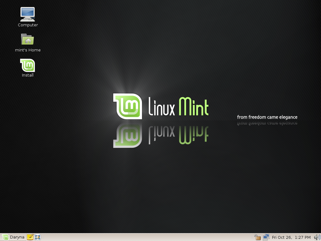
Mint 4.0 Daryna
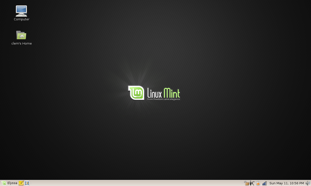
Mint 5 Elyssa
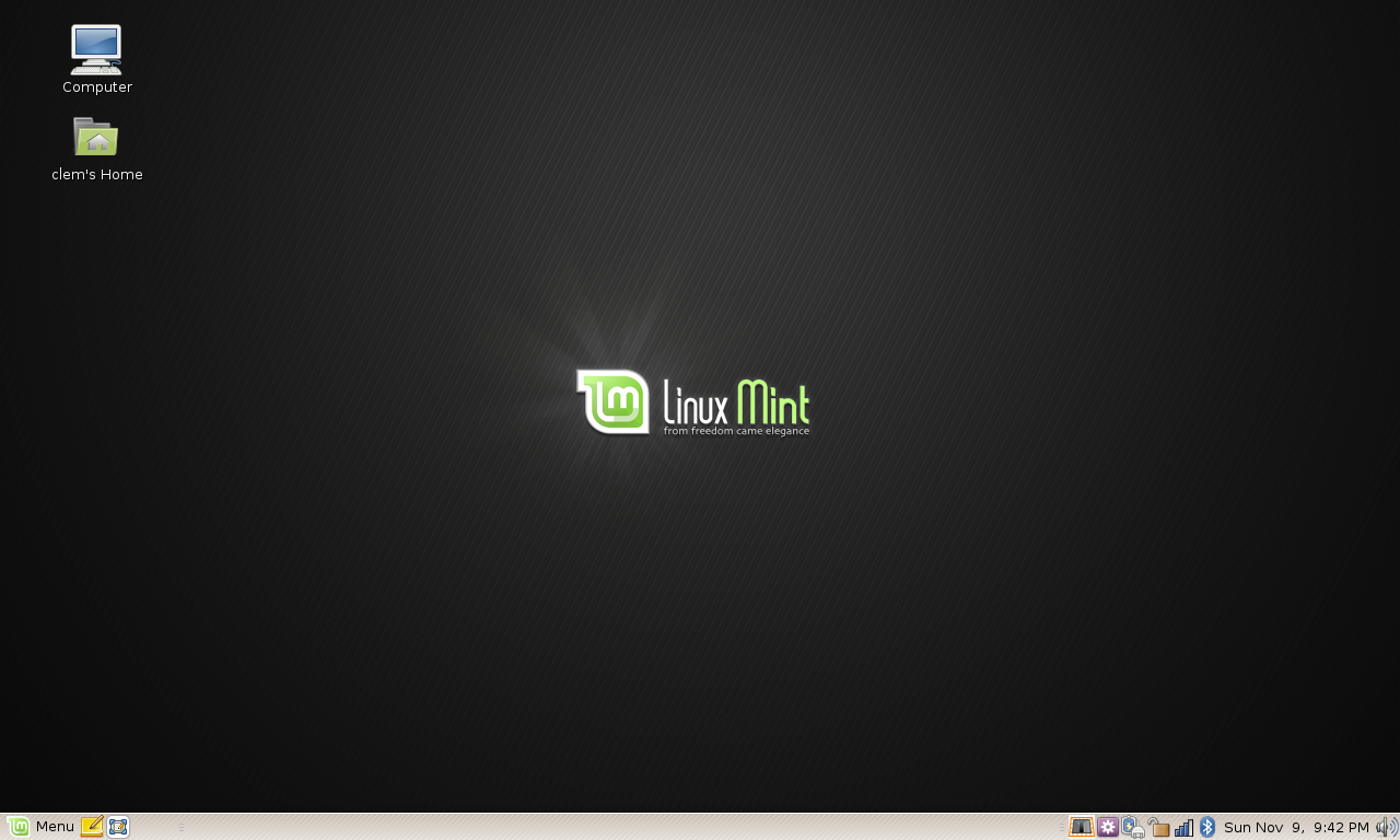
Mint 6 Felicia
We were happy with this theme and it suited most people.
When Linux Mint 6 Gloria was ready to come out people wanted something new, a new artist called Zwopper had surfaced in the community, and there was a new popular style available for Gnome called Shiki. I remember being nervous about changing the theme and so we decided to go for it in the RC release and see what would happen next. The success of the new theme was phenomenal and so we decided to keep it for the stable release. As a consequence, Linux Mint 7 Gloria looked radically different:
Mint 7 Gloria (Shiki theme, Dew wallpaper)
The artwork used for Linux Mint 7 (above) was Shiki for the theme (as opposed to Murrina in previous releases) and “Dew” (by Zwopper) for the wallpaper.
In Linux Mint 8, my intention was to keep the Mint 7 theme and to use a new wallpaper from Zwopper called “Fresh”:

Shiki theme, Fresh wallpaper
Many members of the development team commented on the wallpaper and expressed concern about it. The “Fresh” wallpaper was kept in the default installation (it’s available in the “Appearances” tool in your Mint 8 RC1 desktop) but the default wallpaper was changed to a new one, which was designed by Johonunu. The team was much happier with this new wallpaper and so Linux Mint 8 RC1 ended up looking like this:
Shiki theme, Johonunu wallpaper
The reason I’m talking about all this, of course, is because I see a lot of concern in the feedback I’m receiving for this RC. Many people aren’t happy with this default wallpaper and I don’t know if it’s just that those who like it simply don’t feel the need to say it, or if, really, that wallpaper just isn’t popular.
I know we’re only talking about the looks here, and there are more important things to focus on, but we have time to think about this before the stable release. No matter what people say, the first look, the general impression given by the desktop actually means a lot. Even if people change the wallpaper and the looks then-after, the first impression is nonetheless very important, so it’s important to get it right.
I’ve created a poll below. I would like people not to just look at the screenshots, but to go in the “Appearances” tool and to try the different themes and the different wallpapers before making up their mind. A wallpaper can look very different in a screenshot than when it’s actually used as your wallpaper. One of the options is to organize a paid contest to quickly get new wallpapers on a website like 99designs.com for instance. It’s not my preferred option, not because of the money it would cost but because we would potentially run out of time in asking you what you though of the “new” one.. it’s an option nonetheless, so if you think none of Dew, Fresh, or the older themes are suitable, then please vote that option.
Finally, this is a poll, not a vote. Decisions are taken in accordance with what we think is best and our judgement relies on your feedback. Many thanks in advance for taking part in this poll.
[poll id=”7″]
I like Dew, the style of it. It is abstract enough to not keep drawing the eye to iy, yet pretty to make it an enjoyable background to view. Fresh as waaaay to busy, but i like the abstract aspect of it. Bring the contrast way back and lose the middle part and it may work. Johonunu is to bland. Today you all compete (and yes, visuals DO matter) against SUSE, Fedora,and Ubuntu. Their current default backgrounds are very stylish, art abstracts that give a feel of a polished, professional package. The meat matters, but if the plating sucks then not too many people will eat. I think you guys have a good product (I switched from ubuntu). Now dress it up for the big show.
“Fresh” is far less of what I’d call elegant. It’s more like someone got bored with photoshop – it’s not very soft on the eyes with all those fast transitions from bright colors to black, especially the black stripe in the middle feels just wrong, but the dark areas on left/right bottom doesn’t feel right either. Some areas are just overfilled with details, while other seem empty. LM logo seems more like a nuisance there.
I wouldn’t mind having some “photoshop coolnes” on the wallpaper, but this one seems to be carried out a bit… harsh. Toughtlessly.
It’s a background. It takes 30 seconds to change. I’m staggered we’re even having this discussion.
This is only my opinion but i believe Mint 7 set such a high standard for polish and appearance that users just aren’t feeling the new look for Mint 8 RC. Mint 7 just looked so refined and polished that its artwork didn’t need reworked. At the same time, I dont think Mint 7’s polish can be done in Mint 8 given the fact that grub and GDM has changed, which really is a shame.
I dislike the “fresh” wallpaper. I think it tries far too hard. The Mint wallpaper should be fairly “flat”, similar to those of OpenSuse (This is in my opinion). Otherwise the desktop ends up looking too cluttered.
If you look at Ultimate Edition, for example, the default theme is in my opinion just ugly. It’s not usable, it tries too hard and detracts from the content. I really liked Mint’s “dew” wallpaper, as it was photographic without being too much.
Dew was 7 and it was awesome (drew me in!), but there definitely needs to be something different. The Johonunu doesn’t have nearly the eye-catching “Wow!” as Dew so it seems a step back. The Fresh one is a pretty picture but terrible as a wallpaper – it’s way too busy. Your icons and screenlets get lost.
I would hate to see it go this way, but there are actually some way better choices that were included with Gloria: Swoosh, Butterfly, and Kensai Green, for instance. But I say that I would hate for it to go that way because that’s not new. It’s new for new users, but we’ve all seen them before.
We need something new, eye-catching, yet subtle, and made with the understanding that icons and screenlets will have to be seen against the backdrop. Oh, and it should probably be green 😉
So, that’s a lot to ask for from someone who can’t do it himself, but you asked for opinions. 🙂
Keep up the great work!
I would keep Dew and theme from 7. As PneumaPilot said, maybe it should be something different, but honestly, I don’t really care. It is so easy to change wallpaper, theme or whatever. So, I believe that we shouldn’t be so worried about theme and wallpapers.
I am looking forward for final release, so any theme and wallpaper you decide to put, it is fine with me. If I doesn’t like it I will change it in one minute.
Cheers,
i do agree with pneumaPilot.
it is first look that works or draw people’s attention.The wallpaper on the backfound and GDM is not that great..its very boring.
and the “fresh”wallpaper is also not as good as it was “DEW”.
and talking about theme…the color and the windows borders is also not impressive.though the icon is OK.
do some change with the theme(like change the theme and windowborders to mintgreen and modify humanity iconset to mint green color to get compatiable with linuxmint .
i thought Helena as a much better artwork than this.
the distro is fine though and impressive.
Thanks.
I think it would be cool to see Mint ship with a true dark theme enabled from the get go, one that has everything in a window dark instead of just the title bar. People aren’t used to it so hardly any distros do that. I think it makes everything easier to read, is a lot easier on your eyes, and would be a good way to set Mint apart.
The theme is good, but Trash Bin icon is ugly, change it.
Mint 8 Wallpaper should be nicer, better than the wallpaper in Mint 7
but the Mint style as the one in Mint 7th
Thank you for Mint, it made me realize Linux might be for me. The one, only, thing that put me off, is the omnipresence of the Mint logo. The artwork is generally fine, but one of the reasons for me to try and work with Linux, is my aversion for branding. To be confronted with it at every single stage of startup is ok, you want people to know what is starting, but I would prefer the desktop to be brand free, or just a little signature somewhere. About the choices you are confronted with, I’d say dew (without the big logo), the new screen, although very pretty, is too crowded, dew works better.
thank you again, for the fantastic job you have done already and the new one!
I believe presentation-wise, Gloria did the best. The wallpaper was magnificent, and it complement the theme very well! The only problem with the dark theme is that it ruins the menus of some programs, such as OpenOffice and Firefox. (Dark text on a dark background is hard to read.)
I believe it’s best to stick with the current theme of Helena, with a few fixes to the menu colors (as noted above) and use the Gloria Dew wallpaper as the default.
I’ve installed Linux Mint on the computers of some Windows users, and they were impressed by Gloria, so if Helena looks, acts, and feels like Gloria, then I’m sure it’s the best approach to converting Windows users to the Linux operating system.
Much like PneumaPilot and Coach I loved the Dew wallpaper in Gloria, but Helena should get a new dress. “Fresh” is nice, but I also agree it’s a little busy. It might be ok if you could take out the “bubbles” down the middle of the frame. Anyway it goes, I’m just patiently awaiting the new release of the BEST linux distro out!
for me the mint 8 rc background was not nice
about the theme, the best icons i saw in my life were (Humanity: the same of ubuntu 9.10)
This would be great theme for Linux Mint … http://www.gnome-look.org/content/show.php/Sonar?content=115557 … plus Humanity icon theme but green and this Fresh wallpaper is nice
“Fresh” looks like the wallpaper for oxygen theme in KDE 4. Is it supposed to?
What ever you do keep the dark background and the light theme, love the black and green. As mint becomes more mature to meet the graphics abilities of the newer hard ware I think the direction that you are going with “Dew” and “Fresh” is a natural progression and the right thing to do, but keep the older themes because sometimes I will change wallpaper just to look at somthing different.
Thanks for al your efforts
Keven
The Dew Wallpaper set a high standard, keep Dew until something better is available.
btw: Would be nice if Mint 8 could be shipped with the old gtk theme included.
This wallpapers is very nice.
http://www.linuxmint-art.org/content/show.php/matrix++tech+2+%28black%29?content=114597
http://www.linuxmint-art.org/content/show.php/matrix+tech+green?content=114595
i would do a rework of fresh wallpaper, remove that / line in the middle, doesnt make sense.
I never saw a good set of gnome icons, so any will do.
I’m new to Linux. I fully expected to find a flat, utilitarian interface as I see in the versions pre-Gloria. It was a very pleasant surprise to find “Dew” instead. The fit and finish felt professional and conveyed a sense of permanence and attention to detail. In short, the extra effort you put into the interface has helped me feel great about my switch away from Windows every time I turn it on.
“Fresh” looks fine, certainly displaying artistic talent and a grasp of avant garde elements. I find myself concerned as others have expressed that icons might become lost in some of the background.
“Dew” is a very different look from other operating systems while keeping a homogeneous field upon which to spread your icons. If it is available in the next release, I’ll likely switch back to it.
Thanks again for making such a great product!
Agree with SHEREZADE the logo is too prominent besides green is not among my fav colours much prefer subtle blues & reds .In truth though it,s not really an important issue with linux lovers -but if i was a potential convert from other O/S systems & thinking of changing to MINT i,d be wanting more eye candy – immature i know but 1st impressions count a lot.
The best combination IMHO : Dew wallpaper and light theme (as in Felicia) but with Shiki icons .
I’m one of the people who appreciate Johononu’s work. It is not flashy but it’s classy and elegant. I think that, as a first impression, a desktop should be as professional as possible. Moreover, look at the default wallpapers shipped with openSUSE, Fedora, Mandriva etc; they are all quite simple, and the branding is subtle or non existent. It’s not that I don’t like “Fresh” (I like it and I am a fan of Zwopper’s art!), but it doesn’t fit in a ‘professional’ (i.e. ‘neutral’) desktop. Dew was better in this sense because it was much easier on the eyes and simpler. As someone pointed out, the wallpaper doesn’t have to make the icons unrecognizable or force the user to put them in the less ‘crowded’ zones.
To sum up my opinion: less contrast, less (or no) branding, less brightness, simpler and more neutral. Flashier and more colorful wallpapers, though beautiful, can be included as optional choices.
Oh and please do not take wallpapers from other sources: we have soooo many great artists in the community!!! 😀
I just hope this isn’t holding up the release! 🙂
I voted for the 3rd option – to choose something new. Here is my reasoning.
Johonunu, is very plain. It has a few simple gradients and a green corner… with its own gradient. Simple is good and it is practical as a background, but it just doesn’t have that wow factor. Mint has spoiled us 🙂
Fresh has too many variations in brightness… it is almost ‘busy’. However, I prefer it to Johonunu. From a readability standpoint, a background should have limited variations in brightness especially in the top left corner. This is because that is the default location of icons. If there are extreme variations in brightness, light icon fonts will not be as readable on the bright parts of the background and vice versa for dark fonts.
I think Fresh can be tweaked a little to give an ideal background for Helena. It is beautiful.
I think the Johonunu wallpaper is nice, clean and elegant. Id say keep it, unless there is a better option other than the ones listed.
The problem with the fresh wallpaper is that its…
1. too busy of a design.
2. Kind of low resolution and grainy compared to the rest.
As for the dark theme, I think its a brilliant execution of a dark system theme and far better than the one before it. However I do wish the system tray icons were changed to the black/white ones from Ubuntu’s Humanity icon theme. They just scream “elegance”, and fit very well into the Mint desktop.
lol… I should have read the other comments before commenting…. I sound like I’m plagiarizing…
In fact background not so important, I use most of the time a changing background, consisting of my own photographs, made during holidays and so…
Seamar
I find Fresh too busy, and I hate the soft focus feel. In my mind, soft focus anything is not good. Under any circumstances I feel that it should be crisp. Dew was great, but a little less business like, but very impressive. The old stuff was good. Johonunu is OK. “Fresh” is not an asset.
I would agree with your thought that those who are pleased with the background, or don’t find it as critical, simply do not respond as much as those that would like it changed. That being said, great job on these last few distributions including Mint 8 as they are simply the most “fluid” Linux OS I’ve found. Ok, back to the topic at hand…I believe the Fresh or Dew backgrounds are indeed the best. As long as they are both available options in the final version, or downloadable from your website, we will live.
As much as I’m a fan of abstract wallpapers (Richard Mohler’s works on interfacelift.com grace each of my Windows computers), I’ve always been a fan of the more subdued ones in Mint. Typically, I’d use the diagonal-pinstriped Linux Mint wallpaper if I used any with the Mint logo on it.
The new Johonunu one is perfect, to me. Simple, elegant, and a dash of Mint green, but not overbearingly minty like 7’s wallpaper. (For the record, I’m not a fan of Ubuntu’s “shades of mud” either).
Looks and First impressions are very important – all the way from the initial run as a live cd. Just look at the problems that Ubuntu has with many people just for being brown by default!
The look of Mint was the main reasons I looked more closely and then adopted it – not just the wallpaper but the theme.
Dew is really good and I like Fresh too. It is striking and that’s important. On the other hand the others are frankly boring.
My advice is simple. I like Green and the Gloria default Theme (because it’s different and tasteful), but basically – use something that Looks Good. I recommend Fresh (or Dew) but avoid the other boring ones!
I couldn’t care less about a “wallpaper”, it doesn’t matter what you guys decide, I always remove the wallpaper and place a black screen, I’m all for of functionality, leave the eye candy to Apple users.
LinuxMint is solid as a rock regardless.
I’m running Ubu 9.10 on my desktop box… waiting the Mint 8 Final to arrive.
Logically, it only makes sense to go with the Johonunu wallpaper, since the loader for Ubu 9.10 is so dark and depressing.
Personally, I love the Dew theme, along with a theme called ‘heaven.cube 1.45’ in Firefox. Can’t beat the combination! But, enough is enough. Its already started to look dated!
H-A-T-E the Fresh wallpaper, judging by the picture. It looks soooo last year!
If it was me, Id stick with Johonunu, but get rid of the silly-looking 90’s ‘spotlight’ (at the top). It ruins the whole theme! A gradient black background would be fine, but that spotlight/starburst effect is old as Moses, and looks uber amateurish!
It is my opinion that the green triangle at the lower right corner is what is turning people away from the Johonunu wallpaper. If you could remove that it would be much more appealing to the eye.
The stage lights beaming down from the top is pretty cool. And those stage lights differentiate Helena from previous releases.
In the end, I voted for “same theme, but something new.”
I agree that wallpaper seems trivial, but I do believe that first impressions are important, so I agree that you need to try to get it right (mostly for people who are new to Mint).
I’d say it would be good to use this wallpaper http://www.linuxmint-art.org/content/show.php/A+Linux+Mint+Feeling?content=104356
and add style to choose – SONAR http://www.gnome-look.org/content/show.php/Sonar?content=115557
it would be very nice
I like the absractsness of the “Fresh” wallpaper and it’s IMO much better than the one you changed too.
I understand some peoples concern about it beign to bold and taking a bit to much place. For me this is just a plus, sure, if it was a bit more mellow (fewer colors, dots focused to a smallar portion of the screen etc.) and the logo was a bit more integrated with the background it would be even nicer.
However Johonunus wallpaper is way to sterile and strict. The big green area feels forced and out of place, while the lightening feels stereotypic being from above without haveing any symbolic value.
So in my opinion I think you should either roll back to “Fresh”, and if many dislike it my advice would be to go back to the mint 6 background. It’s mellow and perhaps a bit sterile but has a symbolic value to it. The shine coming from the logo symbolizes the “enlighetenment” and simplicity of Mint.
Love the theme, but I do find the current wallpaper to be rather bland. I do think ‘fresh’ is a very attractive choice though.
My own main gripe with the look of RC1 is the xsplash animation, which is far too small in my opinion. Initially I thought it was a new ‘wait’ mouse cursor!
Why not bundle both? I wouldn’t mind personally!
I agree with Brian that it’s the green triangle that causes the problem. The overhead light is great. I almost immediately switched to one of the other wallpapers (green at the bottom transitioning to black at the top with the mint logo like a comet with a tail of light to top right.
Reading the comments, there are as many for as against :))
I would suggest using the “fresh” wallpaper or something else that is not completely green like the “Dew” wallpaper. One of the biggest concerns (art wise) that I have heard and agree with is the fact that Mint 7 had way to much green. So I would change the icons to something more neutral and even consider using a more neutral less green wallpaper as well.
Lets do a poll and ask which version the Devs should work on first, the x64 or the x32….wallpapers can be easily changed
I really want a light wallpaper, I do not like the the darker wall papers. I find them boring, I do love Dew I do not know to many people that when they look at my background have no said “Oh wow that is awesome where do I get that?”. I would like to see something new though, something truly “fresh”. Fresh is nice, but it looks like a vista-y background.
BUT I rather have that then plain black.
Johonunu easily wins this for me. It’s slick and glossy without being too overbearing, and reminds me of older versions of Linux Mint. I am not too fond of the green corner, which is the only flaw and what would make a lot more people like Johonunu more than they do now.
Definitely not fresh! dew was great…but I would like to see something new. Johonunu is OK but i think the green at bottom right is not the best idea. Without it we can maintain the mood of previous releases before 7. but something new like Dew is always welcome. something which spells out the crispness of a PC’s display…
i like celena and fresh dew is getting old and should be in change backround
I had so many windows users that were blown away by Mint 7. I converted at Mint 6 looking for function over form. However I too was blown away by Mint 7. The beauty was incredible and I never changed anything related to the look. I loved the look of 7. I think the RC for 8 is a step backward: dark for dark’s sake and boring. I would either go with the 7 look again or maybe take a look at the KDE version of 7 since that was an attractive variant.
I love the Dew wallpaper. If changing to a different one, it should be something uniformly green in a manner similar to the Dew wallpaper. I would never use the Fresh wallpaper as it is distractingly harsh. I also find the Johonunu wallpaper distracting because the light from above is constantly messing with your brain and pulling your eyes to the top of the screen. In my opinion, the Dew choice is “minty fresh” but the other choices shown above are not. Dew is beautiful but does not call undue attention to itself.
Personally, I was REALLY impressed by Linux mint 7’s wallpaper/theme… it blew me away… I don’t like any of the Linux Mint 8 Wallpapers.. I think something new is in order, but if a “better” wallpaper can’t be introduced in time for final release, use the wallpaper from mint 7 maybe with a minor modification…..
In saying that, the theme looks fine, but The icons on the folders in mint 8 look like crap compared to the icons attached to the folders in Ubuntu
btw… where the heck is software portal in mint 8? Please don’t tell me that software centre or wotever its called is replacing it… ughhh. The software portal for mint is excellent! and much more amusing to browse through than that crappy ubuntu software centre app…..
Keep the theme, but change the wallpaper to what was in Mint 3.1-6. I’m a big fan of dark colors and themes.
[Hello! I am an ubuntu user, I plan to possibly move to mint in the new release…]
I used shikki theme before but in karmic koala I moved to the bisigi projects themes, I think you can try one of these to change the look to something new:
http://www.bisigi-project.org/?p=51
http://www.bisigi-project.org/?p=55
The wallpaper is ok. Even I prefer the gloria one
Regards
Fresh looks awesome. I used it by choice for a few weeks already. Better than the default Windows 7 Wallpaper!
What’s most missing from Mint, and indeed Ubuntu and all it’s derivatives is separate wallpapers and individual desktops. That has been fixed in some other distros and in Compiz. I think this is a retarded gnome disability.
Having Four separate desktops on a compiz cube:
Work
Play
Internet
Etc.
All with separate shortcuts and desktops would go a long way to organizing and improving any general users day to day experience.
I’ll play with the options for a day first before I offer my thoughts on wallpaper. However, I’ll say straight out, absolutely keep the theme. It’s much more polished and harmonious than the Murrina theme. In the past, the blue of the Murrina theme clashed with the overall greens of the icons and Mint wallpapers, distracting and giving a poor first impression (“Blue and green, blue and green, never together should ever be seen” was rule.) Mint has grown up from a hobby and gone professional, and the harmonious Shiki theme reflects that.
I voted to keep the theme but change the BG to something new. “From freedom came elegance” is a great tagline and I remember how impressed I was the first time I started up Felicia and saw the pretty wallpaper. “Dew” or “Fresh” does not give a sophisticated or elegant impression, instead they give a bloated and “WOW! THAT’S TOTALLY HIP” impression. I’m not sure about the RC1 background either, it’s pretty but You could ditch the shining light.
Keep it timeless, keep it simple, that’s what you want to convey.
Thx for the poll!
My first impression on Helena: oh no! Most of you expressed it already and I couldn’t express it better:
“Looks and First impressions are very important – all the way from the initial run as a live cd. Just look at the problems that Ubuntu has with many people just for being brown by default!”
“Personally, I was REALLY impressed by Linux mint 7’s wallpaper/theme… it blew me away…”
“The look of Mint was the main reasons I looked more closely and then adopted it – not just the wallpaper but the theme.”
“I’m new to Linux…It was a very pleasant surprise to find “Dew” instead. The fit and finish felt professional and conveyed a sense of permanence and attention to detail. In short, the extra effort you put into the interface has helped me feel great about my switch away from Windows every time I turn it on.”
“The Dew Wallpaper set a high standard, keep Dew until something better is available.”
“I’ve installed Linux Mint on the computers of some Windows users, and they were impressed by Gloria, so if Helena looks, acts, and feels like Gloria, then I’m sure it’s the best approach to converting Windows users to the Linux operating system.”
“I agree that wallpaper seems trivial, but I do believe that first impressions are important, so I agree that you need to try to get it right (mostly for people who are new to Mint).”
If you are aiming to new users from especially Windows, Mint 7 is the state of the art!
also agree with Brian, there’s something about that green triangle…
Helena doesn’t give that “WOW!!” impression that Mint 7 gave the first time i saw it. May be that’s because Mint7’s artwork was a huge step forward compared to Mint6.
But it’s still great! So maybe it’s just the triangle )
Guys, really cool themes are those of the “Bisig Project”
Wow!!
http://www.bisigi-project.org/?page_id=6
My first impression with Gloria: WOW! My first impression with Helena: OH NO! as was already said before:
“I’m new to Linux. I fully expected to find a flat, utilitarian interface as I see in the versions pre-Gloria. It was a very pleasant surprise to find “Dew” instead. The fit and finish felt professional and conveyed a sense of permanence and attention to detail. In short, the extra effort you put into the interface has helped me feel great about my switch away from Windows every time I turn it on.”
“I’ve installed Linux Mint on the computers of some Windows users, and they were impressed by Gloria, so if Helena looks, acts, and feels like Gloria, then I’m sure it’s the best approach to converting Windows users to the Linux operating system.”
If you are aiming on users from other OS’es especially Windows, stay with the Gloria look & feel. It’s state of the art and almost perfect!
Love the Shiki-mint theme. I agree with others here that the Fresh wallpaper is too much. A wallpaper similar to Fresh with less contrast would be great.
Husse
server died after posting 49.
Please consider post 50 as double post and delete it. Thx. gees
I honestly think Johonunu is PERFECT — as long as you remove the white circles. They are totally distracting.
Without them, I would feel comfortable leaving the background unchanged for a few days while I customised out the rest of the system.
OOps. I meant, Fresh is perfect. Minus the white circles.
“Dew” was an awesome wallpaper. “Fresh” lacks the element that “Dew” gave you.
i can understand why you want to do this carefully clem because people these days are all about aesthetics. They don’t care what or how it does it just as long as it works and it looks good. Hence why there are so many willing mugs who buy macs (but thats beside the point in case anyone wants to try flaming me). And so first impressions really count these days so that look has to be just right if you’re gonna sway more people onto this platform.
i personally think the theme is fine definitely the best used so far on mint. like others here i agree that you need to follow the Ubuntu path and go with your own variation on the humanity icon theme it will give everything that refined look (this distro is about elegance after-all and that theme is the height of it).
the wallpaper needs to be something on a par with “dew” i reckon a shot of something like the Aurora Borealis at night hued to a “Mint” green might just be the clincher for this release
It just occurred to me that outside of criticisms of it being busy, which I tend to think it is, “Fresh” is best for widescreen dislays on account of the horizontal focus. Note that the screenshot is of a widescreen configuration; it will not look this way, or as good, on a traditional 1024×768 (or whatever).
First, thanks to you and to all members in this project,
great work and keep it up.
I’d like to suggest to change the hole theme, to something like kde4, vista or windows 7, themes for these are cute and exciting.
Truly I don’t like mint theme, every time I change it to vista style.
I like your distribution very much, it make my computer work very easier.
Thanks again “Clem” :-).
Another vote for “this is such a low priority that I can’t convince myself to care about it”. The default look for the RC1 is clean-looking and non-confusing, and by the time I’m finished settling into it I’ll probably have changed it anyway. (For Gloria, I used the Clearlooks theme and a wallpaper called “Elegant Apparition” for an overall blue-and-gray look.)
I made a mistake:
hole theme ==> entire theme
sorry.
I would appreciate the Shiki theme w/o the bottom right green triangle.
After RC installation, I changed the background for an old Mint one (don’t remember the name !)
Some comments say that Fresh is too busy as a wallpaper although it votes over 36%…
I believe that Helena (and any new release) should have a bold, strong statement – just like the Fresh wallpaper that is screaming: look at me – I’m not afraid of anything! After all, many new people will be introduced to Mint for the first time and this wallpaper is the first thing they will see. It has to influence them – it has to make them think: Wow! And like Andy C. says: “It’s a background. It takes 30 seconds to change.”
I guess what I am trying to say is, you ether show off and be bold or you keep it the same as it was before and hope to get noticed.
It’s what’s inside that counts.
Cheers!
More important is that since the last update, Firefox no longer works.
It flashes up. then closes. I am using Opera now.
Mint is marvelous but the loss of Firefox is really frustrating.
Regards
Barry
Dew is from the last version so I think something new would be appropriate. Fresh, while an interesting graphic design, is far too busy a wallpaper in my opinion. I can appreciate the work Johonunu has put into his wallpaper but the grey looks far too blah to get my vote. For such a highly respected distribution, as Linux Mint is, I feel the wallpaper should have an elegance about it. Here is my vision: The spotlight comes up. It sweeps across the dimly lit ballroom floor, bathing the dancers in light, only to come to rest on the lovely, gracefully refined Helena. She stands out from the rest. Will you be her dance partner?
So I would opt for a single elegantly done Linux Mint icon (No text)on a black background with a spot light on it. This would be a variation of the August 2008 wallpaper-of-the-month winner.
http://www.linuxmint-art.org/content/show.php/Wallpaper+Of+The+Month%2C+August+2008?content=86397
Well… i’d use a combination of Humanity for the icon theme or Shiki. Both are great. OR Breathe http://www.gnome-look.org/content/show.php?content=105873 better
For the theme per se, i’d choose the windows decoration of Shiki and for the controls human.
And for the Background… Dew or Dawn of Ubuntu http://www.gnome-look.org/content/show.php/Dawn+Of+Ubuntu+%2B+Ubuntu+Spring?content=54014.
Cheers
I agree with Gilles, I like Johonunu with the Skiki theme, but I think it would be better without the green triangle. I love the Fresh wallpaper, and it’s what I would prefer, but I don’t feel the majority of the population would agree. Like others have said, it’s too busy. I’ve always liked each of the stock wallpapers on the previous versions of Mint. At the same time, the wallpapers need to change. As Clem said, the first impression is big. You don’t want to run it for the first time and see the same Dew wallpaper from Gloria. It would feel like the same old system. You want something that’s going to make you say “Wow, I like the new look!”.
With Johonunu, it follows the same kind of feel as Felicia and previous. It has that dark background with the rays shooting from it. If only it didn’t have that green triangle.
Really, the more I think about it, the more unsure I am on which is best. Personally, I think both of them look fine, and Clem, I’m sure you’ll make a good choice regardless of what you choose.
if you have a plain desktop fresh is great
BUT
if you use lots of shortcuts it is wayyyyyyy too busy
the best you could do is something as graphically impressive but not so busy
please try to customize compiz so you can have different wallpapers on each side of the cube, which you can do you just can’t have shortcuts, i think =) (saw it on youtube somewhere)
il look for the video k
I think that the sky blue color combine with the green of mint. You sould try a desing “fresh” like Gloria with this combination. Greetings.
Beyond the previous tradition of having a dark background and a light theme, you also seem to have a tradition of successive background similarities. Celena and Daryna backgrounds are alike, Elyssa and Felicia backgrounds are alike… Why not add the “Fresh” background as a new option, keep the “Dew” background for this release since it was received so well in Mint 7, and start with another fresh new look in Mint 9. You can develop the tradition of an attractive, minty fresh new look every two releases, giving more time to focus on getting the stable releases polished, and allowing longer periods to come up with the most pleasant first impression for the next new Mint.
I’ve been using the blue icons from Barbara, The blue background from the KDE mint, the aurora buttons, a sky blue for highlighting, and the shiki mint window decoration(its dark grey). I think I have a great blue theme…
(Could you guys upload the Barbara icon set to gnome look)?
I feel sorry for you Clem,
It looks like you have a lot of work to do trying to keep us all happy:
Fresh looks good, just a wee bitty busy for some.
Dew looks real good, but was for an ‘older’ Mint. Time to move on.
Johonunu’s wallpaper is ok but probably too plain, too flat for most.
Going for a pre Gloria look is probably a non-runner.
And keeping the Shiki theme but with new wallpaper could take more time than you really have before Helena’s release.
I really wish that I could help you out but our new kitten has more artistic talent than I do.
Whatever you choose, no matter what, can always be changed if the user feels like he wants a better/newer/older/2D/brighter/flashier/family-photo in a matter of seconds.
So don’t have too much heartache. Even though I know you will.
Thinking out of the box, I am actually using the following on my Mint KDE desktop at the moment . . .
http://www.fotocommunity.de/search?q=Wasser+am+Gras&index=fotos&options=YToyOntzOjc6ImNoYW5uZWwiO3M6MToiMCI7czo1OiJzdGFydCI7aTowO30&display=12543587
Linux Mint, Clean, Fresh, Solid
Thank you.
AfterEight
Perhaps, as in Ubuntu 9.10, photographs could be used as default wallpapers…
What do you think about?
Shiki theme, Fresh wallpaper
I like it best!
I don’t really care what the new dress for Helena will be, because I always change it to what I think was the best theme for Mint ever: the Cassandra-green background from Mint 3.0 in combination with the Lightning theme. The Cassandra-green is really very beautiful and pleasing to the eye, even though it is very simple. Same goes for the Lightning theme – please don’t ever remove this from Mint!
Personally, I like dark themes. I think they just look a lot better. For Mint 6 and 7 I used the PepperMint theme and in 7 the swoosh wallpaper, but it’s really up to you guys.
I tried something. Done in Blender.
http://queatz.com/Helena_Render.png
The background is from the “Butterfly” background and the logo from “Alternate Mint Logos” by Zwooper.
And the .blend: http://queatz.com/Helena_Packed.blend
Regards.
It seems Fresh is leading the poll 🙂
Although the difference between it, Dew, and Johonunu isn’t very big… My suggestion would be try something different, something else. I’m sure there are lots of talented designers in the community…
Oh! Why don’t we include a wallpaper-choice option, for example, in mintWelcome? 🙂 Would be cool 🙂
But, as someone said, please, don’t let it hold the release, pick at random instead 🙂
+ I’m still running my propaganda of putting more wallpapers, more themes in mint. I don’t think it really matters which one is on-screen by default. If user dislikes it, he/she goes to Appearance and changes it. For a lot of people I installed Mint, that was one of the first steps taken in Linux system – navigating to Appearence window…
P.S. Poll is a great idea! There could be polls on which software to include by default, which version of Firefox there should be, which architecture should have the priority etc etc. 🙂
My first run of Gloria this year soothed my eyes and my mind so much with that “Dew” background… And at the same time made me think that Mint was a different distro.
I work at the computer, and think that one of the greatest benefits of the evolution of eyecandies (which follow hardware evolution, of course) is the possibility to make working at the computer something much less of a burden for the eyes, the mind and – why not to say – for the soul.
I think there are a lot of flamboyant distros that value desktop fireworks and the like, but if “elegance” is a word to choose, Mint should go the “peace for the eye and the mind” way by default, and put the flamboyant themes and wallpapers there for each one to choose.
I’ve tested Helena for about a week now and i can tell you that like Ubuntu karmic this release looks and feels very solid and stable. Leaving that aside the looks of it is smooth clean but think it’ll look better with a fresh face starting with tray icons, i think they are tango (I’m not a mint geek) maybe if the karmic tray icons style is used or something similar it might be better. Also a new wallpaper will be nice, the colors are nice specially the mint green that’s more like a signature for Linux mint.
I wonder if you could add some of that mint green to the windows borders maybe like a gradient in some place.
In time: totally agree with Xyie Fourseasons.
An attractive, minty fresh appearance is a must! Quality over speed!
I have just tried “sonar” theme proposed by Giga, and it’s indeed awesome. Very close to Shiki theme but more refined and polished.
The Dew wallpaper is great, it was one of the things that drew me into trying Linux Mint (I’m now a linux convert).. it’s a fact of life that first impressions really do count and the Dew wallpaper made Mint stand out from the crowd. I don’t see a reason to change it unless there is some unspoken rule that new versions “must” have a different wallpaper.
And to all those who say “it’s just a wallpaper, it only takes 30 seconds to change”.. that is not the attitude that has made Mint one of the most popular Linux distros. Attention to detail, such as having a such a good wallpaper that users don’t feel the need to change it, is what has made it so popular.
I like the Fresh wallpaper. I think it gives the overall look a more “Updated” feel. Personally I feel that the menu panel at the bottom of the screen could use some sleek new graphics but overall I think it looks very polished. 🙂
I suggest to keep the theme but change the wallpaper to a modified version of the excellent Dew, where you just should change the water droplets by shiny and maybe half blueish water snowflakes…
Regards,
Mike
I think the new theme rocks! I noticed the slight change in the window buttons on the taskbar and it looks great. I like the color too! The icons are really good and I believe the wallpaper could be better. I voted ‘keep theme use fresh.’ But, after reading this I think ‘fresh’ might be ‘too much.’ In my opinion, I think the wallpaper should be mostly green with some pizazz. Not a lot of pizazz but something. The wallpaper in the RC realease didn’t excite me. Dew did! But Helena needs something new maybe. I definitely like just the mint icon in the center of the screen. Thanks for listening. Clem, you do a great job at what you do and alot of people appreciate it, more than you know. Whatever you choose will be good!
http://img3.imageshack.us/i/grassina.jpg/
from
http://www.omgubuntu.co.uk/2009/09/new-photo-wallpapers-land-in-karmic.html
This one would be a nice one:
http://img3.imageshack.us/i/grassina.jpg/
… it is part of Karmic:
http://www.omgubuntu.co.uk/2009/09/new-photo-wallpapers-land-in-karmic.html
Definitely keep the Shiki theme. Dew was awesome but something new would be nice. Johonunu is too boring and Fresh is too busy for a desktop. If at all possible, do a contest.
Really fresh wallpaper: http://www.newvistawallpaper.com/d/33384/-/thin-grass_1600_x_1200.jpg 😛 Something like this will be great for Mint.
The “Johonunu” one looks really bad. I think “Fresh” looks pretty solid, better than “Dew” anyway. I’ve never been a fan of the Shiki theme, but that’s because I use Clearlooks. I do change the window border to Shiki-Mint-Metacity-Border and the icons to Human-Blue though. So really, I’ll end up changing the background anyway since it won’t match at all.
Dew is by far the most elegant.
Fresh kind of brings in the surrealism in many Linux distros….
The black background of our Mint predecessors were boring.
I think Mint 7 made the biggest difference for the good…
It made MINT different from “the bunch”.
Thanks for the effort!
You guys did a hell of a job in this distro overall, that the screen seems kinda trivial….
SALUTATIONS AND CONGRATS
cleMINT, you ROCK!
I would vote for this one, maybe merged with Dew…
Now for the link…
http://www.linuxmint-art.org/content/show.php/A+Linux+Mint+Feeling?content=104356
I’m going to have to add a +1 to azn’s suggestion (post #38). It’s clean, geometric, and elegant, and the mint logo is present but not obtrusive or dominating.
The theme is also nice, I would keep Shiki as default, but it makes for a great option that fits with the mint philosophy of elegance.
First impressions are important. Especially when trying to attract new users. For people familiar with Mint and Linux the background won’t be a deciding factor for use. But aesthetic appeal is the first thing new users are going to notice.
Personally I really liked the wallpapers from Felicia. The dark background with the Mint logos. The dark was easy on the eyes. The simplicity implied ease of use. Dew was also nice. But I think that a new release needs a new background.
I don’t care much for Johonunu, especially the green in the bottom right. And over all it seems kinda amateurish compared to all the other wallpapers the community has to offer.
And although I like Fresh, it is to busy and the contrast is to high. Perhaps if it was more subdued.
But regardless, Mint is the best desktop Distro I have used. It just works. Thanks for all your hard work guys! Eagerly waiting the final release. Will be upgrading regardless of the art.
personally i think you should have all of them available there kick arse
shane Says:
November 16th, 2009 at 5:39 pm
I think Fresh can be tweaked a little to give an ideal background for Helena. It is beautiful.
————–
I agree with Shane observation. That’s the right point.
Nice to hear from you again Shane. Your Fluxbox CE 6 “Felicia”
still runs very well within my Windows Vista. I love it.
I think the theme is more important than the background and I really dig the shiki theme. Before moving over to Linux mint I went through a lot of trouble to change my windows xp theme over to a dark background with light text. Its just so much better on the eyes, especially at night in a low light environment. Sorry I don’t use my pc in office with fluorescent lights only. I personally use the swoosh image on the desktop. I prefer dark simple backgrounds. The background should never interfere with the icons and preferably I want to be able to stare aimlessly at the background for hours without going blind.
The dew desktop is great and was my first introduction to Mint. But I also installed the fluxbox version on an older machine and that’s what led me to the swoosh background which is now the background on all three of my mint machines. Swoosh is easy on the eyes, especially at night, doesn’t detract from the icons and I can just stare until I realize I was actually going to do something, then I never see the desktop again until I shutdown. But I get to enjoy the theme. Dark with light text. If only I could the default window handling to be dark with light text.
Plus the best page in the universe answers why you want a dark background with light text in the faq section
http://maddox.xmission.com/
I like the Mint 7 Theme and Background. It makes me feel quenched like drinking a cola.
Cheer!
I am still a relative newbie, started with Felicia. Changed the wall paper almost immediately for my personal photo. Upgraded to Gloria and loved Dew. I believe that Mint is the best distro out there and loved the initial impression Gloria gave. Looking at Johonunu’s wall paper i believe it could be improved for the spotlight to be the “Mint” green and dump the green corner. The Skiki theme would work well and it would have a polished “Mintish” feel that still seperates it from other distos. Just my opinion.
I like the Dew wallpaper, but with the Shiki theme, I thought there was just way too much green. So I reverted to the Daryna wallpaper (I really like the reflected logo, and wish there were a more modern version of that), Shiki-Mint controls and window borders, a subdued blue for selected items, and LinuxMint icons. For Helena I would really like to see a dark version of Dew with a Daryna-like reflection as the logo.
THe logo should remain centre stage. The background should be a development of Dew to maintain consistency and credibility over a number of releases. Dew was very successful. Fresh is likeable but fussy and resembles the kde oxygen theme (in green) which is passing it ‘sell-by’ date. Old geezers (like me) can change everything. The potential converts matter more when it comes to logos etc.
I like the first ones (Daryna) with the Mint Logo and title having a reflection below it. So, keep Johonunu and put a reflection under it. Awesome that would be 🙂
Imho Shiki needs a lighter wallpaper, because a dark theme on a dark wallpaper just becomes difficult to use. Dew was elegant, simple and light enough to perfectly fit with the dark default theme. Now I really would like to see something as light and as simple as Dew, but not Dew itself which is now old.
Fresh is great but it’s a bit too dark… the wallpaper on the rc is two steps behind… it’s flat and actually too dark. Take fresh and tweak it to make it easier on the eyes… 😉
I believe a competition should be held. The winning designer can get recognition and the community can contribute. It is worth attempting to see the quality of submissions. A top 5 can be selected which can go to a community vote prior to the final release.
I think a new theme and background would be good to maintain the elegance of linux mint.
Current offerings can be improved on.
@azn
wallpaper from the same artist from Sérvia – Serbia
A Linux Mint Feeling
http://www.linuxmint-art.org/content/show.php/A+Linux+Mint+Feeling?content=104356
Very Nice! It could be an alternative for Mint 8 “Helena”
@AfterEight
Diamonds and emeralds…LOL!
It’s a foto but it really does not matter at all.
With the Mint Logo (middle-centre) added to it plus Mint slogan
(not necessarily), sure we would have a very pretty wallpaper
It would need to be tweaked to get the final touch.
Again: Vey Nice. it could be an alternative for Mint 8 “Helena”
http://www.fotocommunity.de/search?q=Wasser+am+Gras&index=fotos&options=YTozOntzOjc6ImNoYW5uZWwiO3M6MToiMCI7czo1OiJzdGFydCI7aTowO3M6NzoiZGlzcGxheSI7czo4OiIxMjU0MzU4NyI7fQ/pos/4
But i think we must focus on the poll.
One word:
Swoosh.
Swoosh.
Swoosh.
Swoosh.
Screen is “OK” as is however, it might look a whole lot richer if the “ray” shinning down on the Logo would change colors, nothing “sharp” just pastel-type! (Sort of a rainbow affect.)
I happen to really like the Johonunu wallpaper, and would choose that as the default for Mint 8 if it were my choice.
I have enjoyed Linux Mint 7’s theme, however, I do feel there should be an completely new theme. Something green. but no stripes, something bright for the wallpaper and the theme, maybe something from nature.
I wish you could give the bottom panel a 3D glossy look. It looks pretty plain the way it is now.
Mark
Hi,
I agree with Patrick. I think that a contest can be a good thing. All people and specially designers can make things beautiful, like glossy themes or others.
We could vote for the best themes proposed.
I like a lot “fresh” and i don’t like for sure Johonunu’s wallpaper but was a good try just it’s not a good first impression for the system.
If not fresh dew still stand as a good option but with the dejavu feeling making us fell like the same as mint 7.
Actually give me the 3.1 wallpaper with a much softer reflection (maybe a soft water ripple effect) with the new theme (got to lose that gray Windowish task bar).
The default wallpaper should be distinct, like an advertisement. It lets the new user know whose distro they are using. Basically you should think LiveCD and new users.
Anyone who has used Mint for any amount of time is going to do their own thing. As pointed out before, it is easily changeable and not something to get wrapped around the axle.
I think it’s an extremely tough choice, as originally, linux mint was what introduced me to linux (as far as installing 15 OSs on an HDD goes) It was my all-time high for quality and a great alternative to Windows. I think That the Johonunu background Is pretty good because it feels like more of an updated Linux Mint 1-6 Background. So keep that it’s more like almost every linux mint OS, it feels more “linux” minty.
However, the Dew background is one of the largest improvements / changes in choice of theme, and at first impression, is fantabulous to every user, thus it makes a great first impression. But after staring at it for just a month, it felt kind of “down”. I noticed more than just green in the background (not literally speaking) but I noticed that it was like looking out a rainy window, waiting to see something new, other than the rain on the window that I was looking at. It almost felt small, as if there were nothing else to do when it was raining.
This is where the name “fresh” speaks out the most. I really Like the fresh desktop background the most because it’s more detailed, almost more high-definition feeling. It manages to not be down feeling to me, but more up feeling of an emotion, and still being green. The name “fresh” also makes a lot more sense than “dew” when looking at the word “Mint”. For instance, you don’t say “Mmmm..I just brushed my teeth, taste the dewy-goodness” you say (and pretty straight up too) “Mmmm..I just brushed my teeth, taste the minty freshness”
The fresh background also feels a lot more abstract, and almost even makes me think of drinking Sprite.
When I put in the RC live disc, I went through the backgrounds and A huge fist came out of the screen punched me in the face, and said “I pitty the fool who don’t choose this background” Thanks Mr.T!
I really think that so far as style goes, Linux Mint is on its right track! I look forward to Linux mint 8, and hope to use it as my default OS when the full release comes out!
What I don’t like about Fresh is the “bubbles”. They remind me of the KDE wallpaper. The rest of it looks pretty good though.
Dew was nice. something understated at first glance. it didn’t hold your eye, but was pleasant to look at.
Fresh is a bit too busy. the elegance of simplicity was lost.
granted i will change the wallpaper as one of my first chores. but for a first appearance…do the dew. 🙂
the johonunu wp is ok apart from that triangle at the bottom.
then it would be more appealing to have feature to select different backgrounds for the 4 workspaces
I like the default wallpaper and theme combination of Gloria. I’ve changed the wallpaper from time to time, but eventually return to the Dew background. In fact, it’s what I’m using now.
Also, I think the Fresh wallpaper it way too busy.
My beef with the Johonunu wallpaper is the bottom right green triangle. It just feels out of place. If you remove it, or maybe do something with it (expand on the idea, mirror it to the left side, stick some useful information, whatever) it would work, but as is I just feel it is wrong somehow. The Dew wallpaper was really nice and the pre-Mint 7 wallpapers would work well with the dark gtk+ theme.
Also, the one thing I really don’t like about the default icon set is the Firefox and Thunderbird icons. They look really flat and colorless to me, not very attractive compared to the rest of the theme. Also the OpenOffice ones seem out of place. They are gray little circles were everything else is colorful and all. OpenOffice 3 has some really nice looking icons and if the default icon set used those as well as the default Mozilla icons I would be very happy.
Of course, in the end it is just a background and icon set, both of which are easily changeable and customizable. Just include the Mint 7 desktop backgrounds withe Mint 8 and I will be happy as a clam.
I like the Dew and the classic Carbon wallpapers the best, although Carbon is to dark to be used in conjunction with Shiki-Mint in my opinion. Linux Mint has to look like it sounds. The only reason the Shiki-Mint theme worked well was because the Dew wallpaper was so bright, and the moisture gave it a fresh feeling. The new Johonunu wallpaper is good, but the bright green in the corner makes it look like a superhero costume, and it doesn’t give the impression of minty freshness. Fresh, on the other hand, is too complicated and dark to feel as if it belongs with the Linux Mint namesake. I don’t have the ability to use any software to create my own work, but I would suggest that without another wallpaper like Dew (which I suspect would be very difficult to replicate with any originality), Linux Mint would be better off not going down the road of dark greens and blacks. It’s too much of a contradiction given the Mint name. I believe it should not feel like a dark sci-fi movie, like the Matrix, but should feel light and bright with greenish overtones.
Andy C Says:
November 16th, 2009 at 3:26 pm
It’s a background. It takes 30 seconds to change. I’m staggered we’re even having this discussion
<—- What he said
What about a window pop up first time after install showing a list of 5 backgrounds to pick from. then everyone is happy
I think that Dew is the best, but the Fresh in any case better than that Juhonunu’s artwork. So Dew,but maybe Fresh too 🙂
P.S. Thank you Clem for you work and big thanks to all Mint Team!
“Dew” was and is pretty nice. There’s nothing wrong with Johonunu’s wallpaper, either; it looks professional. The “Fresh” wallpaper is probably a bit too, what’s the word, non-traditional to be your default. Unless that’s what you’re going for. Do you want the “charcoal suit” look or the “Hawaiian shirt” look?
Off topic, though: could you please, please, _please_ include some non-branded wallpaper with the distribution? I, um, must admit I’ve never terribly cared much for the LM logo. (No offence meant. Really. Great distro. Flame me to a crisp if you must.)
IMO something new should be proposed: Karmic is really nicer compared to previous Ubuntus! Linux Mint, though excellent, feels “old” in this sense..
I have been involved with designing graphics for several projects where a new look with public appeal was desired and where competitions were held. I was surprised by the results of such competitions and found out the public is hard to please, but discovered three general principles.
1. People are greatly influenced by trends. (i.e. What looks good to someone is partially based on personal taste, but new rising styles in the graphics design world heavily influence what they consider to look nice.)
2. People generally like a subtle “clean” look, and don’t like stuff that shocks the senses too much.
3. An old adage in the design world still holds true. “Three strikes and your out.” Meaning that any design like a wallpaper should have no more that two major elements. This is why I think many don’t like Zwopper’s “Fresh”. It has the curved background elements, the overlapping glowing circles, a heavy gradient element cutting across the center, and add to that the logo and icons which are kind of lost in the slurry and you have way to much going on.
The angular “god rays” of light from above has been being done for quite a while already, especially in Vista, so it does not look fresh. Fractals have been over-used as of late, and so have shiny reflections. The aurora borealis look is heavily used in both Vista and Win7.
Dew had the subtle clean look, with a soft depth that people liked. It had two elements the dew drops and the logo. Juhonunu’s background basically has three elements, one of them being the over-used “god rays.
If you want the perfect wallpaper to please the most people, follow the rules of composition, like the rule of thirds, give it depth using subtle tones and highlights, and do research on popular graphic artist websites to see what the newest trends are.
-Ritho
I like the Johonunu wallpaper, but the bottom right green triangle needs to be removed (or made to look like it is peeling back, to reveal green underneath). I also like the black theme but i feel that the default taskbar with basic and unattractive icons should be more modern or slick, by default. Alternatively, using plain white icons would also look good against the black taskbar. In other words, the ocins by default should be super-slick, or super basic, like in Windows 7 (bottom right of taskbar) or Mac OS X.
Fresh is ok but the light beads look too much like the KDE wallpaper.
I am not bothered either way as I always use the old lighter theme and change it to use green instead of blue, and use my own wallpaper (usually photos or movie screenshots),
can we have smaller icons, the icons seem substantially smaller with the fresh wallpaper u have put a screenshot of above..
as everyone says the wallpaper can be changed, but the icons seem difficult to render a change in size, thats my most important concern.
don’t like johununu’s, and zwopper’s is too flashy..
frankly, keep the mint 7 one itself, coz of its simplicity n elegance.
sir i have one problem with all the editiion of linux mint that i cann’t configure the mic for any messenger clien application like skype or empathy,but i can record inernaly on mint give me a better solution
I think that the fresh wallpaper is terrible as a background for production use. I personally use a nice simple light mint wallpaper.
However, I think the fresh is an excellent default wallpaper. As soon as I install it, I will change it. But when I boot a live cd to install on a friends computer for example, I want something that impresses them, something bright and sparkly or whatever.
So I say use the Fresh wallpaper.
Tim
Just to add to my previous comment,
people who use linux Mint will not be turned away by the wallpaper, but people new to linux Mint might be attracted by the wallpaper.
Thus a bright impressive wallpaper is better.
Tim
1. gloria was superb. Keep it as an option
2. rc1 one is also elegant but seems people dont like too much black. Try to invert black to green and green to black (or grey) and see how it looks like
Hope that helps
Dew was such a welcome change from the LINUXMINT billboard style wallpaper. Neither of the two new options suggested live up to the Mint potential. Perhaps the simpler style should be the default, it really is quite easy to change.
In any event, please do not let the window dressing hold up the release. Please pass my thanks to all of the artist who donate their talents to the Mint project.
I personally don’t care as long the slogan is going away “from freedom come elegance”, it just feels very unproffesional and corny. Hopefully it will get removed from bootsplashes too.
First off fresh sucks! It draws the users eyes to the bubbly crap in the middle of the screen and away from the desktop icons, start menu, and anything else you would want to look at while doing your daily tasks. Sure it’s pretty but to the point of distracting.
Second. Linux Mint 7 is the sleekest, sexiest, most refined operating system in the world today point blank! The dew background with the dark theme and green icons is like drinking a cup of hot tea on a rainy day. It is soothing, comforting and people looking out of their Windows are sad. I have used Linux Mint for over a year now after buying a laptop preinstalled with Vista…2 months after that I installed Mint 5 Elyssa. I will never go back! Keep up the good work, keep the dark theme with the Dew Background and thank you so much for everything you have done for me and the Linux community. HOORAH!
MA2
Forgot to add, if you look closely at the DEW background. The linux mint symbol is on the far side of the pane of glass you are looking at. I think its not rain that is wetting that glass but all those Tears of people looking through Windows?? hehe couldnt resist!
i already found mine:.
https://wiki.ubuntu.com/Artwork/Incoming/Karmic/NightImpression
kudos to the author
Given the choices currently shown, Gloria’s Dew wallpaper is by far the best and most striking. For many people, it has become the symbol of Linux Mint, along with Shiki-Mint/Shiki-Wise as the theme. They work so well together. Perhaps a new wallpaper could be something as simple as a similar (but original concept photograph utilizing moisture on glass somehow) image, obviously with the excellent Linux Mint logo superimposed, and that such a style could be established as a tradition, much like Microsoft’s grassy field. It would surely make wallpaper selection much easier in the future.
come on now …. who cares what the wallpaper is… we are Linux users so I thought that meant we are a cut above meaning how hard is it to change your wallpaper folks? I think you can find other things to dwell on other than something so insignificant… as long as it works, I am happy. 🙂
Personally I use dark themes but that is another thing that can be changed easily.
Shiki theme, Johonunu wallpaper. Why? Because It seems to be more elegance than Fresh & Dew, imho. 🙂
Dew may be the best compromise – it is nice but some people don’t like fresh.
Also if there will be a KDE version, the blue Dew is also good and shows relation to the green one. Maybe that will be more difficult to achieve with fresh.
Theme is good? wallpapers I change a few times in a day (I think Dew is good), but can you do something with icontheme? Change icons for something smaller and more likier
Thanks
As I don’t put any icons on my desktop (that would look way too busy for my taste *g*) because I work with gnome-do I like my wallpapers plain eye-catchy and I prefer Zwoppers’ stunning artwork Fresh or Dew or others of his collection.
Dew was very elegant an so is Fresh, but in the end, when keeping all as an option, every user can decide for her/himself, even load a self-created wallpaper.
I really like ‘Dew’ (Mint 7 default) as the wallpaper and don’t think it needs to be changed, although it could be argued that a new release should include a new look. I’m not a big fan of the current proposed wallpaper (RC1 default by Johonunu). Not that there is anything wrong with it. It’s just a little to bland for my liking and doesn’t have the visual impact of “Dew”. On the other hand, the “Fresh” wallpaper is more colorful and attractive…just a bit too busy. Can we try it without the black line in the middle (and less bubbles)?
I’d love to see something similar to “Dew” in terms of impact and effect but a little more like “Fresh” in terms of color range (light/dark) It’s virtually impossible to create a ‘look’ that everyone will love (and very hard to improve on the look of “Gloria”) but with the nature and size of the Mint community, I’m confident you’ll come up with a great look. If in doubt, stick with Dew!
I met linuxmint on version 7 … before that was completely unknown to me. So, before changing the Dew wallpaper I began to try it and use it, and I found this new distro so clean and elegant that perfectly matched the simplicity and perfection of the Dew wallpaper: fresh, simple, effective. Even though the new “Fresh” wallpaper is an excellent artwork, I believe it’s a bit overloaded to express the simplicity and easy of use of Mint.
Thanks!!!
As a newbie I don’t mess around much, but after installing the RC I suddenly realised that I was missing the Dew wallpaper, and I managed to change it back. 🙂
Normally I don’t care at all about those things, so this was a first for me.
I’m really thankfull for all your hard work … but will probably change to the Dew wallpaper no matter which one you choose in the final version.
Thanks.
another thing, can we have this on mint (or do we already!)
http://code.google.com/p/gnome-colors/
Външният вид е много важен. Той е като луксозната опаковка на стоката. Тапета на Мента 7 е красив. Когато се махнат тъмните полета, светлите тонове създават по-хубави чувства. Благодаря за възможността да участвам в дискусията.
The appearance is very important. It is like a package of luxury goods. Mint wallpaper 7 is beautiful. When you remove dark field, bright tones create a nice feeling. Thanks for the opportunity to participate in the discussion.
I like the dew wallpaper very much (even use it on Ubuntu installs). But it should be changed slightly to make it different from LinuxMint 7
Désolé je ne parle pas anglais.
Je pense qu’il serait peut être temps de proposer quelque chose qui montrerait que l’évolution n’est pas qu’à l’intérieur, si vous comparez un Mac ou W7, les OS linux en général ont un train de retard au point de vue esthétique, je serais pour un peu d’innovation plutôt que de resservir toujours le même plat en changeant uniquement la sauce.
Something more Elegance ……. ^_^
A new theme and new wallpaper will be highly appreciated. Can we also have a widgets bar like Mac OS but at the right side panel of monitor ?
Three months back when I was in a dilemma to shift from Win to linux, it was the theme and the wallpaper which impressed me the most and helped me made my mind. Offcourse, the codec packs and flash player, latest OpenOffice, Nvidia drivers etc. elegant features did play their part too but the first thing which actually compelled me to dwell into the features of Gloria, were the beautiful wallpaper and theme screenshots.
I think that DEW was good, but after some time I change it for a mix that I make by my self. I’ve to agree with AndyC (nº 3 Nov.16th – 3:26pm) it’s just a background, you can change it in no time.
For instance, maybe there have to be something new for LM 8, but it isn’t the main concern about a new distro.
Have a nice day all of you out there!
Salutes from Argentina 🙂
I just started using Mint (7) in a VM and I have to say, part of what really impressed me was the polish and simplicity of the style. I run Ubuntu on 5 other machines.
I am with the camp that thinks the new “Fresh” wallpaper is a beautiful display, but too busy. I voted for “Dew”, but what I’d really like to see is something *similar* in style to “Dew” but updated (since it IS a new release, afterall).
Also, I’m happy that this discussion is taking place. Supporters should understand that to accomplish what Linux Mint (as well as Ubuntu and other user friendly distros) wants to accomplish, polish and form are VERY important to selling the product, right out of the box.
Again, I support a more flat and simple background, like “Dew”, or maybe “Dew” again, if it isn’t bad news to keep the same background across releases.
Thanks!
–mobrien118
It seems to me that Fresh is a very polarizing wallpaper. I personally detest it, as seems to be the case for a number of users around here, while a number of others seem to absolutely love it.
On the other hand, the one in RC1 is flatter, less exciting, and generally gets less of the people who really love it. But by the same token it isn’t hate-able… it’s too simple to conjure the word “garish”, as Fresh does in my mind. But, like so many other things these days, the wallpaper in the RC seems to be seeking minimalist looks, but failing because it’s lacking the “sleek” that minimalism brings forth.
Dew was, as everyone says, great. But it seems to be the norm to change things up as much as possible from release to release.
With that in mind, I would cast my vote on the side of finding a new option if it’s possible, with Dew as a fallback. It seems like there’s more than enough problem with the first two to keep them if they can be avoided.
People have already linked to these above, but I thought they were the best two possibilities:
http://www.linuxmint-art.org/content/show.php/A+Linux+Mint+Feeling?content=104356
http://www.fotocommunity.de/search?q=Wasser+am+Gras&index=fotos&options=YToyOntzOjc6ImNoYW5uZWwiO3M6MToiMCI7czo1OiJzdGFydCI7aTowO30&display=12543587
I’m inclined towards the first, because it seems to fall in line with the pattern other major distros are going with this release: Clean and professional, but still colourful. The second is darker, but could give mint a more unique look.
I like Mint so much but why would you stay with the same theme or image ..?
CREATE !
see the difference between Windows XP and Vista And 7 ….this is what i call a change…
linux is a solid OS with a very Hard core 😉 but why wont you guys make it more attractive ??
I know 6 months is small time but plz try to come up with at least a new look
Good Luck
Historically speaking, Helena was a goddess of Greco-Roman mythology, and the main cause of the Trojan war. The “Dew” background begins to take the visual element of Linux Mint in the right direction, but for Helena we need a texture that suggests the draping effect commonly seen in clothing of that era. Helena needs something “fresh and new” (where Linux is concerned), yet classic. Perhaps look to the Parthenon for inspiration?
I say stick with “Dew” and work from that as a starting point to develop the ideal wardrobe for Helena.
I didn’t mind the Helena RC1 Shiki theme, but the menu bar being dark/black as well really detracted me from it. Dark is ok, in fact it’s good as a background, but the menus need a lighter feel to it to differentiate and say “Hey, I’m not the background”
The Fresh background is nice, and suggested above, very very strong… too strong. I’d like that if it were more “fresh” all over the background to keep the whole area consistent, rather than just the center/middle. Mentioned above, the bubbles were distracting, since they were more like placed there than actually being part of the background.
The Dew background did set a high standard, it blended nicely as a background, consistent area coverage with not so big contrast. It was a little bit bright for me, but nice nonetheless. Also, nothing wrong with sticking to the same wallpaper for Helena either, it is very tough to come up with a new artistic concept every 6months (give or take a month) without a dedicated artist who’d commit with a clear idea on what to do.
None saying which I voted for, but here’s my comment.
I’m inclined to think that you know you’ve got the meat and potatoes where they need to be when people start worrying about the tablecloth. I’m quite surprised this is even being discussed. But since you asked…
I liked the older dark wallpapers, for initial openers. Easy on the eyes, not distracting. After a little bit I would always change them anyway. The Steampunk one was a fave. I use a lot of my own nature/scenery photographs too.
When Mint7 came out I was immediately smitten by the Dew wallpaper. It’s nature feel really appeals to me, and it’s photographic without being distracting. Abstract and yet realistic at the same time. Elegance to the core. It’s still on all my Minty boxes, though in a de-logo’ed version I cloned upon. I also ported my now generic Dew to the windoze box I have to use from time to time.
Fresh is pretty, but way too busy in the center for me. Johonunu is okay as an opener, but I will be changing it to Dew, unless something else more attractive and functional comes along.
That said, I’m going back to chowing on the meat and potatoes. Great stuff!
Fresh is great !
Indeed it’s more sparkling, more modern, and still peaceful and sober.
And even in non-profit things, i don’t need to see “slogans” in front of my eyes. “From freedom came elegance” is a nice sentence but I don’t want to see that useless information as I work…
And yes, I guess, many of us change their wallpaper but 1st impression is important.
Cheers from Belgium.
I didn’t mind the Johonunu wallpaper – it strikes a good balance between displaying the logo and making sure people know what distro you’re running, and not being overly flashy.
The Fresh wallpaper was “too loud”. The colors were way too bright & saturated, and that gets distracting.
And I personally prefer dark text on light background themes to light on dark themes
Here are some wallpapers from Zwopper.
http://zwopper.deviantart.com/art/In-The-Pool-129101117
http://zwopper.deviantart.com/art/Mint-Droplets-132389519
And for KDE
http://zwopper.deviantart.com/art/Mint-Droplets-KDE-132739984
http://zwopper.deviantart.com/art/In-The-Pool-KDE-129117491
I believe Fresh is the best. I would love to see the actual theme upgraded, but left the similiar style (to make it a little better, but do not change the theme).
I personally like the wallpaper from RC1. Looks clean and brighter than the previous defaults, and I’m not a big fan of all the green in the other wallpapers.
The one thing I do miss in the RC is the LinuxMint controls, they are what I am using now and I like the look of them — can it be brought back?
Fresh is the best but I agree with #22 superboki, it needs a tweak toget rid of the line down the middle it’s distracting.
Zwopper does some of the best artwork of any Linux OS, keep up the good work! :o)
I prefer to have a nice, new one. This one is pretty cool and easy to the eyes. Wyt?
http://www.linuxmint-art.org/content/show.php/Mint+Marble?content=115586
I translated into English with Google:
Sorry I do not speak English.
I think it might be time to propose something that would show that evolution is not inside, if you compare a Mac or W7, the Linux OS in general have a train late at the point Aesthetically, I’d be a little innovation rather than reused always the same dish by changing only the sauce.
Wallpaper and theme is far less important than better hardware support, also all of the webcams, printers, all-in-oners,…
Work on it! I still stay tuned with the God, Ubuntu 9.10 Karmic. That’s a real Linux-distro. the others….:-))
I think that it helps for each release to have a default wallpaper that distinguishes it from what came before.
I liked Dew; it struck a good balance. Fresh is a touch strong for my taste, but I think the older ones (and Johonunu) are a touch staid.
That said, I think a less busy wallpaper is better as a default, but no matter what it is easily changed and should not be the source of too much anxiety.
Fresh is to busy for me, but I could live with it for long enough to change to something else. On the other hand, I kind of like the Johonunu, except for the flare at the top. It’s too bright and jarring compared with the darkness of the rest. Tone down the flare, and I’d be perfectly happy with it.
Or just toss it all out and go with a steampunk wallpaper.
As a long time Linux Mint user, I think the best wallpaper is Dew, but I ‘d also like to see a new background in Mint like Fresh, which is beautiful but should be tweaked. IMO, it should be softer and without the black area in the middle of the screen. Please, keep the Shiki theme though.
Of the latest options, I like Dew, but I really like the reflected logo and slogan in Daryna. What about a dark version of Dew with the reflected logo and slogan from Daryna? I’ve made up a crude layout of something like that but I haven’t posted to linuxmint-art.org because I don’t know which license to choose or whether I need Zwopper’s or anyone else’s permission.
I agree with a few posters that the bottom right corner of the new wallpaper is a bit distracting. Just try darkening it up a bit and maybe add some separation.
Something like:
http://www.ldrit.com/LinuxMint.png
As for now, though, the most ‘professional’ wallpapers are Dew and Johonunu’s. As I said, ‘Fresh’ needs some work in order to look good for the final release.
Not very Minty, but bea from Daryna is still my favorite.
The dark Shiki theme is awesome.
I have noticed that user choice of distribution is strongly influenced by default themes and colours, with KDE desktops quite popular simply because of their clinical light blue/gray appearance, whilst some distributions like Ubuntu’s darker brown themes attract quite derogatory comment, regardless of their underlying quality.
Most ‘newbies’ are also ignorant of how easy it is to change themes, colours and desktop background ‘wallpapers’.
If the final installation information screen were to illustrate how easy it to play with Menu, Control Center, Look and Feel, Appearance and its ‘Get more themes online’ link, it could make a surprising difference, especially if this was to be accompanied by already incorporated ‘SpearMint’ blue/gray and ‘OrangeMint’ warm colours to better suit different personal colour vision ?
I posted yesterday but seems that the message lost…
Well, for the Icon theme i’d use Elementary Art https://edge.launchpad.net/~elementaryart/+archive/ppa, or Breathe (Oxygen+Human) https://launchpad.net/breathe-icon-set, or Humanity or Shiki. in that order…
For the windows decorations i’ll stick with Shiki, is great… non invasive and good looking.
And for the controls i’d use the new human seen in karmic.
For the wall, Dew or Dawn of ubuntu http://the-mitsuhiko.deviantart.com/
https://edge.launchpad.net/~dylanmccall/+archive/ppa
Cheers
Hi, I’m still a newbie to linux, I’ve been a convert to open source for less then a year. I’m a graphic designer and this of course is just my opinion but aside from what’s under the hood in linux mint one of it’s greatest attractions is just how beautiful the distro is. While I personally like the “Fresh” wallpaper it is just very cluttered, and there’s a lot going on. It just doesn’t feel elegant, it kind of throws that amazing first impression. But at the same time the Johonunu wallpaper doesn’t achieve this either. It is a nice wallpaper but it just doesn’t get the job done in my opinion.
I enjoyed “Dew” but would not want to see it as the default for this edition. I think if it came down to it a contest would be a good idea and the problem you mentioned earlier about getting feedback would be letting the users pick essentially vote on which one is their favorite, I mean you get final decision anyway so why not?
I would like to say I am VERY GLAD that Clem and the other developers are taking the time to get this right. I have converted a couple people to Mint from Windows, and it was truly the initial wow factor that got them over their hesitation. Thanks guys!!! Don’t let the “it’s only a wallpaper, easy to change” naysayers dissuade you!! 🙂
I like both of the suggested Helena wallpapers but for the default I would stick with Dew from Gloria. It has the nicest colour tone and it is detailed enough to be interesting but bland enough to function perfectly as a wallpaper.
Shiki is also a much better choice of gtk theme than any of the older default themes so I would keep that.
Now that the RC is out it seems a bit late to be considering coming up with a new wallpaper/theme/icon set before the final release. I would think that it would make more sense to ship LM8 with what we already have and then take the next 6 months making a concerted effort to polish the theme and icon set and develop a new background that (almost) everyone is happy with.
Yes, you have to keep in mind that this is the #1 distro for converting newbs to Linux (in my experience by far). The default theme is going to be very important!
Zwopper has a second version of Dew that looks rather nice and would distinguish between 7 and 8. I suggest that one. It’s got a bit more contrast but doesn’t have the “head-scratch-what-is-going-on-here” feel of “Fresh.”
http://zwopper.deviantart.com/art/Mint-Dew-II-Full-123604508
Here’s an idea for Linux Mint 9! During installation, why not present the user with a few themes/wallpapers/icon sets to choose from? You could cover roughly 4 to 6 different “personalities,” so even the default installation gives you a choice out of the box!
Now THAT would really set Mint apart from the other distros!
Yes I like Johonunu wallpaper, but please also consider: LinuxMintBG. I have downloaded this from your site and have used it as my wallpaper for several weeks now. It is clean, clear and striking yet also allows a user to see any desk ikons clearly – so it is easy to live with on a daily basis. It is neither too black and dull, nor too bright and green – a good compromise.
Agree with Flan,
Choosing themes and wallpapers during installation is a great idea i think!
I vote that we keep the shiki theme, but ditch both wallpapers. They aren’t bad, but there are better choices. I suggest this wallpaper from Zwopper called mint marble: http://www.linuxmint-art.org/content/show.php/Mint+Marble?content=115586
Thanks for allowing user input. Can’t wait for Helena.
It’s been said here before, is it really that hard to right click on your desktop to change the wall paper?
I wish all things would be this easy in Linux.
Just pick something, anything, as long as it works. We can always change it later. I like the black, I like the Dew. Busy is just too busy.
I’d like to keep the theme but go back to the Felicia wallpaper, personally; I like the brighter effect of this new one; but I think the green in the corner doesn’t fit and the light needs to come from the Linux Mint logo, be that by moving the logo or centering the “shine” again. Just my thoughts.
I agree… One of the most important aspects of a new desktop is the initial appearance. Linux Mint gets this right, while many others seem hell bent on adjusting to the times.
well i’m not the most educated on this kinda stuff, so my suggestion may seem ridiculous to you guys but i would say….why not just give it a completely new type of theme, since it’s a new OS
Hey boring works for me so I selected the older dark wallpaper without the green section in the lower right corner. The login dialogue is awkward since it remembers my username thereby changing my login habit. Well, I have gotten used to it but please remember the principle of least surprise for design.
Fresh is an awesome wallpaper!
IMHO, Mint’s 7 artwork doesn’t need be replaced. Keep wallpaper and theme from 7 with the new icons of shiki.
I liked the wallpaper on Mint 7 better than this new one, but as previously stated, many people change the wallpaper anyway. It is good to see that this is one of the very few things that is bothering people about the release, and not anything major…..:)
I use my own theme (slickness black), icons (azenis icons), and wallpaper anyway, but I am not a new user looking to be “impressed” with linux. It’s what’s under the hood that counts for me, if I want it to look nice, I make it do that myself!!!!
Mint has already made a great impression on me, and I have the pleasure of showing others how much better linux is than other operating systems that cost money are. I have converted quite a few people with the impressiveness of Linux Mint!!!!
Thank you team for all the hard work that goes into making this the best distro around.
Windows Vista let’s you choose a background. Ubuntu, Fedora and opeSUSE decide the background. The thing that makes me say wow with Linux Mint is the idea that it freshens up your desktop like a mint does to your mouth.
I think Linux Mint should play off it’s name and create a background that is soothing to the eye’s kinda like Dew did. Johonunu makes me think of Ubuntu too much. If I wanted Ubuntu I would use Ubuntu, but Linux Mint needs to say “use me cause I am fresh and minty”.
Other then that you guys are doing a good job. Looking forward to reviewing the final release.
I love the Dew wallpaper and the Shiki theme with one non-love: Green. I understand that mint is green. Saving the planet is green. “Go” is green, but when I install Linux Mint, the very first thing I dew (get it?) is open the GIMP and change the hue on the background to blue. Blue is much more visually appealing to me. Should Mint keep the dew background? Possibly. It’s very nice, but I think the issue is the color. BTW, I came from Ubuntu. Nice backgrounds, but the brown is horrid. Make the Mint logo a little less prevelant; we all know what we’re running. I have been mildy involved in graphic arts in the past and what caught my eye with dew was litteraly the dew. Makes it look . . . well, clean. Fresh, something new. And surprisingly like the water on the hood of a freshly waxed BMW when hued blue. Not the same old distracting series of circles and other hard shapes as in other distros; like Fresh. And Shiki, decent. As much as i’m risking getting flamed worse than a Aztec sacrifice, Windows (Vista and 7) and Mac OS have much more refined and polished icons. Unfortunately, in this “Hi, I’m a PC” and “Hi, I’m a douchebag MAC” world, visual appearance seems to mean more to the general populous than underlying technology. This is one of the major reasons I feel Linux hasn’t moved its market share up the ladder quicker. But of course, I could be wrong. Bottom line: doesn’t matter what it looks like. Mint rules.
I like freash theme, looks nice to me. I’m on opensuse but I miss mint 🙁
Benchmarketing. One thing that MS undouly does well is marketing It’s OS, the wallpaper are very atractive and easy to change. We should just follow this and just get a nice scene with no logo and set it as a default wallpaper (much like windows) so people will surprise after they realize this is linux runing not MS Windows.
Just my idea
The first impression is always important. My vote is for Fresh 😉 it looks really cool! By the way, where can I get it? I want it now… ;D
For me the Wallpaper doesn’t matter, I can change it later.
But as I’m always trying to find new friends for mint, an attractive design at startup would be a good point for presentation.
As Angel said: The first impression is always important.
I voted for fresh.
Luckily, shortly after Windows7 there is more: Mint8
Good work!
Vote for Fresh…..:)
The default theme for mint 8 rc1 and mint 7 i.e. yhe black shiki mint theme is the best i hav found in a linux distro so keep it the same.
Now for wallpapers:
1)Dew is cool and can be added in the wallpaper package
2)Fresh looks kind of sci-fi and i hope it should be avoided to make mint look cool and professional
3)Johunnu should be by default as it cleary states the distro name with a black whit glow, making it look more professional.
[mint 7 failed to load a live session on some pc’s but ubuntu 9.04 did load on all pc’s—-do cure this problem]
I like the theme. It’s one of the things that drew me into Linux Mint. Can’t wait for LM8 to be released.
When I first saw the Johonunu wallpaper, I didn’t really like. But as I continued with it, the look kind of grew on me. The older default wallpapers I always thought were a little too dark, and I would always change it to swoosh or spring to lighten the colors up. Mint 7’s wallpaper looked nice, but the icons seemed to blend in because there was little to no contrast. The Johonunu wallpaper however, lets the icons stand out more. It is also lighter, adding in just enough color to make it visible but still keeping to the black/gray/green color scheme. (it still doesn’t top the “Swoosh” wallpaper. That one was near perfect as far as color scheme and balance)
@AndyC.
Can’t you for one moment think about the bigger picture?
A lot of people know you can change the appearance. But what Clem says is right. Especially if you’re trying to attract as many people as possible to your OS.
“No matter what people say, the first look, the general impression given by the desktop actually means a lot.”
It means nothing to you, or me. But that’s not the point.
If it means nothing to you don’t comment. But you even had to go as far as commenting on it on something which looks like a Twitter clone. (I’m not putting that site itself down. I don’t use such services and have my own opinion on them but there are people that do like them so fair enough)
Did you get out of bed the wrong side or something? Chill out. Each to his/her own.
i did lol
Just ship with Dew AND Fresh, and you’ll please the majority… then make the wallpaper chooser dialog scan online and allow an easy choice between all the highest scoring alternatives on the art website – that should please 99% of users.
Dew by default (because it can be like a brand for Mint and you already have a blue one for the KDE version) but please please make sure Fresh and other nice ones are included on the basic install!
My 2 cents…
I think Fresh is the way to go for this release. I do agree that it’s a little too chaotic for everyday use. However, it’s about first impressions, about a little ‘bling’. Dew is great, but you don’t want the same wallpaper twice. You need visual confirmation that you have in fact, installed something new and improved.
I really like the serenity of the Johonunu wallpaper, and would prefer it for everyday use. The suggestion of being able to choose a different wallpaper (or look) at first startup (after install), is a really good one. Maybe it can be written in for this release already…
Mint is an elegant soft look.
Fresh is not a soft look. it is more like a KDE shine look.
Please Keep Mint soft as always.
As many other people have said, Fresh is too busy and the wallpaper used in RC1 is not elegant enough. Fresh also has a different hue than the mint color scheme, which really doesn’t fit. Dew is by far the nicest, and I think it should be kept until a wallpaper can be found that isn’t a regression.